DOI:10.32604/iasc.2021.018009

| Intelligent Automation & Soft Computing DOI:10.32604/iasc.2021.018009 |  |
| Article |
Blind and Visually Impaired User Interface to Solve Accessibility Problems
1Department of Computer Science & IT, The Superior College, Lahore, 54000, Pakistan
2Department of Software Engineering, The Superior College, Lahore, 54000, Pakistan
3Department of Informatics and Systems, University of Management and Technology, Lahore, 54000, Pakistan
4School of Computer and Information Technology, Beaconhouse National University, Lahore, 54000, Pakistan
5INP, ENIT, Tarbes, 65000, France
*Corresponding Author: Muhammad Waseem Iqbal. Email: waseem.iqbal@superior.edu.pk
Received: 21 February 2021; Accepted: 27 April 2021
Abstract: Blind and visually impaired (BVI) users often have interface accessibility problems while using mobile applications. This study was conducted to reduce the cognitive effort required for interface navigation by identifying the accessibility issues according to the user’s mental model. The study evaluated the accessibility of smartphone screens to solve organizational, presentation, and behavioral (OPB) problems of using mobile applications. Usability evaluation of an application was conducted and validated with a specific focus on BVI user experience. A total of 56 BVI participants were included in the evaluation. Overall, four tasks to assess organization, avoidance of redundant information, serialization of content, and style and text presentation were assigned to the selected participants for a newly developed smartphone application. Ethnography, task completion within a specific time, and system usability scale (SUS) techniques were used for analysis and post-task evaluation. The results showed that the organization of the application was 100% effective for both blind and visually impaired participants. The efficiency of visually impaired participants was better than blind participants. The highest level of satisfaction among the blind participants was with the presentation (with a score of 87.62), and the highest level of satisfaction among the visually impaired participants was with the organization and presentation (with a score of 89.21 in each category). Overall, this study indicated the application reduced the severity of OPB problems, offering higher usability with increased satisfaction level and enhanced effectiveness and efficiency for BVI users. Furthermore, the calculated results were provided a significant solution of OPB for BVI users. Hence, this study provides design and development guidelines based on a practical evaluation to overcome the smartphone application accessibility problems of BVI users.
Keywords: Human computer interaction; accessibility problems; blinds; mobile application usability; user interface; visually impaired
Usability evaluation of applications, interfaces, websites, and devices has become a significant research concern in the domain of human–computer interaction (HCI). The term usability can be defined as the ease with which users can interact with an application, interface, website, or device without formal training. Accessibility, a subset of usability, is the feature of services and products providing ways for individuals with special needs to use the services and products. The initial focus of accessibility for blind and visually impaired (BVI) people was providing the capability of interaction with touchscreen smartphones in executing daily routine tasks such as reading text and identifying colors and objects [1].
Mobile applications have growing features and functions, but the screen size of mobile phones and limited input/output interface capabilities make it quite difficult to design accessible mobile applications for BVI users. Accessing and using information from websites and desktop and mobile applications by BVI people is not an easy task. Desktop and mobile websites and applications should have customized usability features for BVI users to support their learning process.
In recent years, smartphone applications have become ubiquitous in everyday life. Numerous tools and techniques are available to enhance the usability and accessibility of websites and applications for the BVI community. Companies have developed computers and laptops with specialized settings to make the systems more usable for BVI users. Similarly, touch-sensitive user interface designs, such as in mobile applications, can help BVI users navigate applications. Voice input mechanisms, speech recognition, windows narrator, and HTML 5 vibration APIs are some tools that enhance accessibility for BVI people. Other accessibility tools include smartphone applications like TalkBack, which is a screen reader, and Voice Access and Google Assistant, which enable tasks to be completed via voice commands. Some of these methods were not specially designed for blind users but have been widely adopted by BVI people [2]. However, many accessibility problems have been identified with voice command and screen reader applications, particularly limited functionality. To optimize efficient and effective usage, user interfaces should be specially designed to provide usability and accessibility to the BVI population.
Although different methods have been presented in the literature to overcome interface accessibility hurdles for BVI people [3], there is a lack of an organized approach to improve the usability and accessibility of smartphone applications. Mobile applications have expanded many features and functions, but the screen size of mobile phones and limited input/output interface make it difficult to design mobile applications for the BVI population. To gain the acceptance of BVI users, the design attributes for BVI-friendly user interfaces should be included in the development of mobile applications. Therefore, BVI user behavior and usability must be thoroughly assessed and understood to optimize the design attributes for accessible interfaces.
Despite the extensive literature on the usability and accessibility of websites and smartphones, many of their functions are inaccessible to BVI users as a result of companies not insisting their designers adhere to accessibility guidelines in developing the websites and applications. Furthermore, many accessibility guidelines are available, but there are no practical studies on solving OPB problems in mobile applications.
In this study, accessibility and usability problems were divided into three main categories encompassing critical OPB problems:
• Accessibility problems in the organization of the application, including lack of logical structure, page content serialization, and information overloading.
• Accessibility issues at the presentation level, including the layout, style, and text presentation.
• Behavioral accessibility issues, including the listing of redundant information.
The aims of this study were to solve the abovementioned OPB problems and develop a mobile application with a novel interface for BVI users with improved accessibility features. The objectives for the novel interface were to reduce the effort of the BVI users while executing different tasks on the mobile application by incorporating accessibility in the user interface design. A user centered design (UCD) process model was used to validate the user experience based on the effectiveness, efficiency, and satisfaction of BVI users. By describing the methods used to solve accessibility and usability problems, this study provides design and development guidelines for BVI-friendly user interfaces.
The accessibility of mobile applications is important because it provides access and services to BVI users. The mobile applications with accessible problems can result in a poor user experience and dissatisfaction. The structural parameters such as information overload, structure serialization, layout presentation style, and text presentation are shown in Fig. 1, for accessibility problems. The screen reader crash and redundant information at presentation level can create conflict for BVI users to access the desired contents.
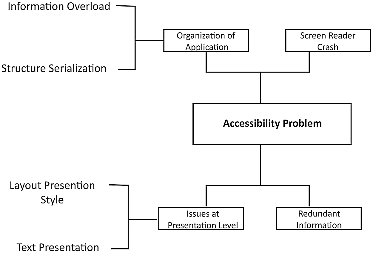
Figure 1: Accessibility problems
Touchscreens are not inherently accessible for BVI users. Some solutions to the lack of accessibility include gesture control systems [4], screen reader services (e.g., Apple with VoiceOver, and Android with TalkBack), and text to speech systems. Other tools include the option for large text, screen magnifiers, adjustable color contrast, adjustable screen brightness, accessibility shortcuts, and virtual assistants such as Google for android and Siri for Apple. These services permit BVI people to operate smartphone interfaces. For example, a screen reader can help a blind person figure out where to tap the screen.
Although current smartphoneshave built-in accessibility features that can help the BVI community to execute their daily routine tasks, many websites and applications remain partly or completely inaccessible. Enabling considerable accessibility is a challenge because of diversity in features such as change in user requirements, interaction, and development issues. A previous study developed a blind-friendly accessible user interface where simple activities were performed on smartphones. Based on the feedback of 41 blind participants, the interface provided an improved user interaction experience with smartphones [5].
In reference Park et al. [6], the authors developed an e-book application based on a new standard of accessibility for blind users. To identify the most problematic accessibility domain, the authors performed an accessibility test on 50 commercial electronic books in Korean E-market. Based on these standards, some implications and guidelines were proposed for developing and writing e-books.
Another study [7] was conducted to improve the usability of digital librariesfor BVI users to lessen help-seeking situations. In reference Guerrón et al. [8], researchers compared the patterns of different interfaces. They compared four interfaces for gestures and three interfaces for beep and voice while examining the unknown spaces. The main goal of their research was to determine which interface was more effective and efficient at identifying, locating, and detecting objects and structures in unfamiliar situations. The findings of their research showed that the voice interface was considered a more significant interface for effectiveness, efficiency, and cognitive mapping.
The authors in reference Iqbal et al. [9] defined an input method for text called “Braille Enter.” This method provided non-visual interaction support on the touchscreen interface by using one finger. They found that using one finger for interaction on the touchscreen was more accessible for BVI users.
2.1 Problems with Organization of Applications
In Tab. 1, the flaws and key features of some mobile applications based on the experiences of BVI users are presented.
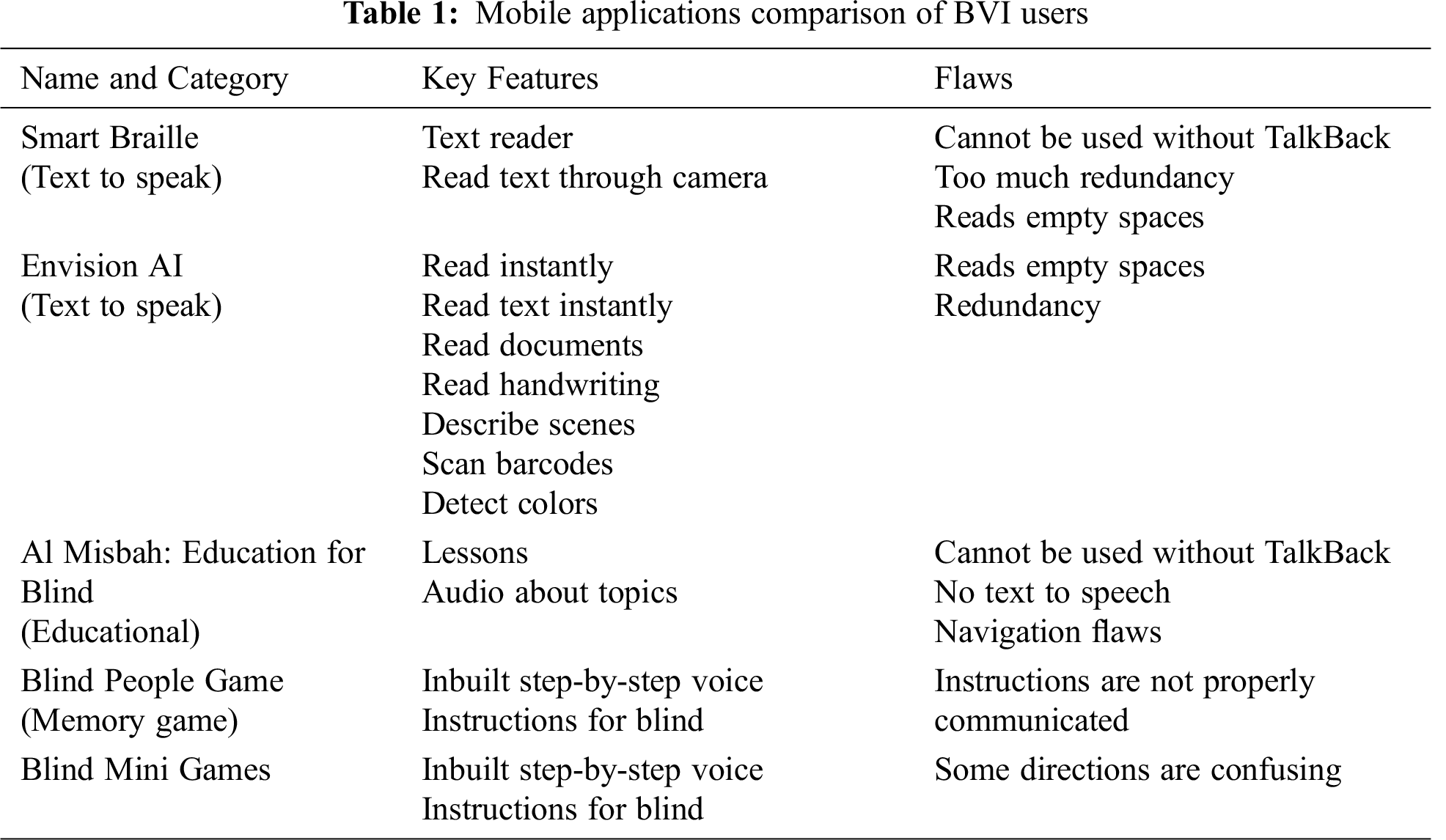
Organization of an application refers to the conceptual structure of the system that regulates the task flow. The researchers in references Inostroza et al. [10,11] suggested that an interface should follow a predictable task process and have an easy structure that is simple to explore. Structure refers to how information content is displayed on a mobile screen. The information available on the mobile application should be accurate and up-to-date. Furthermore, system quality perception (navigational structure and visual appeal) and elements for web design (navigation, information, and visual) have a significant effect on user trust [12,13]. Mobile applications should provide good navigation facilities to complete a task accurately and in a reasonable amount of time. Therefore, for BVI users, accessibility and usability principles suggest that the organization of the application must be intuitive and explicit even when presented through audio.
Furthermore, when the contents of a screen are presented in serial order, this can create information loss by increasing the cognitive load and confusing BVI users. Screen readers only support the text written in the serial order that is associated with a natural reading process. For BVI users, it is difficult to listen to and understand figures, tables and MCQs by using screen readers. Therefore, the text should be formatted in a way that requires a specific reading order for figures, tables, and multiple-choice quizzes [14,15]. Minimal information about visual content in an interface prevents BVI users from being able to identify the task flow and perform tasks quickly.
There is a great need to solve the abovementioned issues, such as by indicating the screen layout and content organization through voice input and audio.
2.2 Problems with Behavior of Applications
Common problems BVI people face with user interfaces are screen readers crashing during accomplishing tasks on websites and applications. Sometimes the audio of a screen reader can only cover some portions of applications. Another problem is when blind people are compelled to listen to the navigation bar (page title/header) before detecting the page content in applications. To avoid listening to redundant information and to overcome the conflict or crashing issues that arise with screen readers, there is a need for a mechanism that will customize applications.
Another paper addressed the issues visually impaired users encounter while surfing the Internet by using screen readers. The authors compared different state-of-the-art screen reader tools that were used for the accessibility of visually impaired users [16].
2.3 Problems with Presentation of Applications
The authors in reference Lee et al. [17] introduced a checklist of accessibility problems that provided guidelines and implications. It is important to represent the layout and style accurately when people use applications. As BVI user presentations are based on voice modality, the audio and text representations in an interface are critical factors of usability and accessibility while developing the application for this population.
Display functionalities and contents are limited on mobile phone screens compared to computers due to their smaller size. It can be problematic for the blind and visually impaired when information is overloaded on screens. Moreover, certain application layouts can confuse screen readers. Furthermore, page content serialization and certain website structures can complicate accessibility for BVI users.Well-designed websites and their contents play an important role in attracting the attention of users. In the electronic world, users interact with websites and applications through an interface, so a well-designed and well-organized interface is key to user satisfaction.
The good quality of an interface design is important for the success of a website [18]. The authors proposed a system in reference Khairnar et al. [19] that effectively assisted the visually impaired. Their system consisted of a simple architecture and different modules, which made it easy to use. This system could assist visually impaired users to detect and recognized obstacles. Similarly, the authors in reference Neto et al. [20] presented an architecture and methodologies for the development of games for deaf and blind people. The user interface for the deaf was based on sign language, and the user interface for the blind was based on audio language. In reference Muqbali et al. [21], the authors innovated a smart stick that assisted blind people to live in a more comfortable manner with the help of artificial intelligence (AI). In another study, an interface on the web for visually impaired users was proposed based on formal concept analysis. This interface reduced the effort and operation time of visually impaired users [22]. The study in reference Toro et al. [23] presented a methodology to implement a navigation system for the blind. Similarly, a framework to help website developers make accessible interfaces for visually impaired people was created in reference Germano et al. [24].
In another study [25], the authors created an application that assisted visually impaired people to navigate easily using public transportation. Another paper [26] presented a methodology that identified banknotes. This method was widely used and helpful for visually impaired people.
2.4 Accessibility Problems Checklist
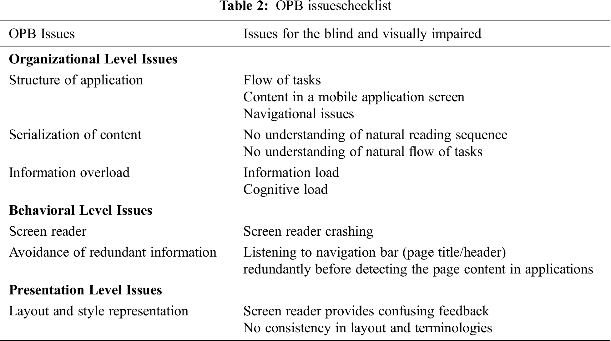
To overcome accessibility problems while developing mobile applications, categorized OPB problems [5,10,11,14–17] are clearly depicted in Tab. 2.
2.5 Effectiveness and Efficiency
Effectiveness is related to the quality of informational content, whereas efficiency is related to the ease of understanding and ability to use that informational content. Some authors suggested that efficiency and effectiveness are related to the ability of a user to complete a task within a reasonable amount of time. Researchers in Inostroza et al. [10,17,27] utilized efficiency and effectiveness as two cognitive parts of their proposed model. Moreover, efficiency is equivalent to perceived ease of use, and effectiveness is equivalent to usefulness.
Satisfaction indicates a positive attitude toward an item; E-satisfaction is defined as a customer’s positive attitude toward a website design [27].
3 Research Design and Methodology
In this study, the UCD process model shown in Fig. 2, [28] is used to create and validate an educational smartphone application with a BVI-friendly user interface. The process model is composed of the following steps: i) problem identification, ii) development of educational application, iii) targeted domain, iv) experimentation, and v) evaluation.
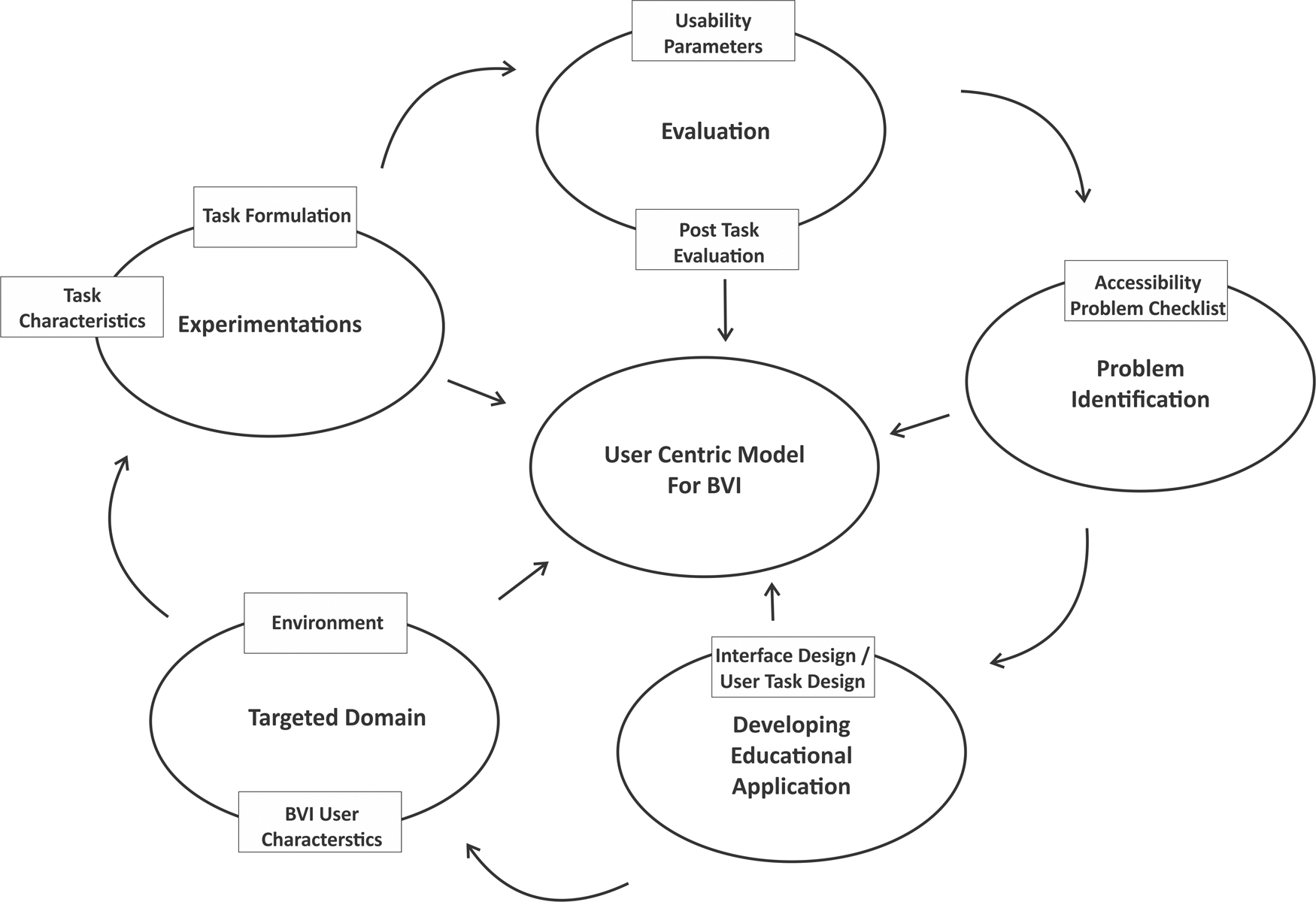
Figure 2: UCD process model
The first step in the UCD model is to identify the problem. For this purpose, we reviewed the extensive literature and tested some mobile applications for BVI users and then developed a checklist of associated problems. By categorizing OPB problems, this step helps ensure all critical accessibility problems are considered while developing reading and listening mobile applications.
3.1.1 Issues at the Organization Level
• Application structure: How well the audio describes the flow of visual information and original functionality on the screen.
• Page content serialization: Assessment test based on multiple-choice questions (MCQs).
• Information overloading: Information loss due to reading every single word of text in serial order.
3.1.2 Issues at the Behavioral Level
• Screen reader conflicts: Screen reader crashes while using the application.
• Avoidance of redundant information: Listening to navigation bar (page title/header) redundantly before detecting the page content in applications.
3.1.3 Issues at the Presentation Level
Layout, style, and text presentation in screen reader provide confusing feedback, so there is no consistency in layout and terminology.
3.2 Application Development for BVI Users
In this study, an educational mobile application entitled “Read Master” was developed. It provides basic and scientific information through a BVI-friendly interface designed to solve the accessibility problems identified in the previous step.
This mobile application consists of a series of two main sections: informational science content and an MCQ quiz. This application is tailored for BVI users and available in both visual and audio form with embedded screen reader functionality.
The application supports the text-to-speech mechanism also. In Section 1, the application provides information about different topics, subheadings of topics, and a brief description of each topic. The application also provides an assessment test in the MCQ format as shown in Figs. 3–6.
Prior to starting usability testing, an expert on the mockup of the prototype performed a walkthrough. After the first release of the application, user acceptance testing from expert reviewers was conducted. A series of user acceptance tests were performed to ensure a high level of usability.
Once the developed application was found to be reliable, effective, and efficient, it was deemed ready for usability testing from respondents.
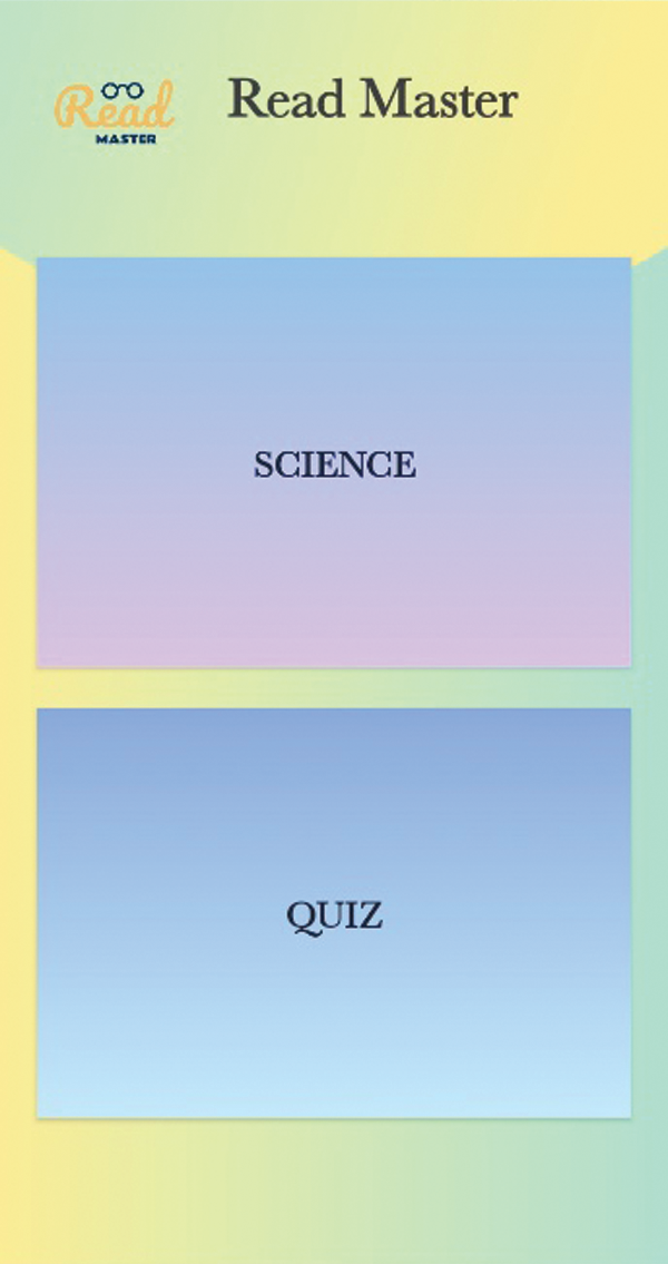
Figure 3: Main section
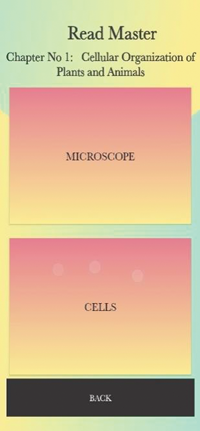
Figure 4: Subsection
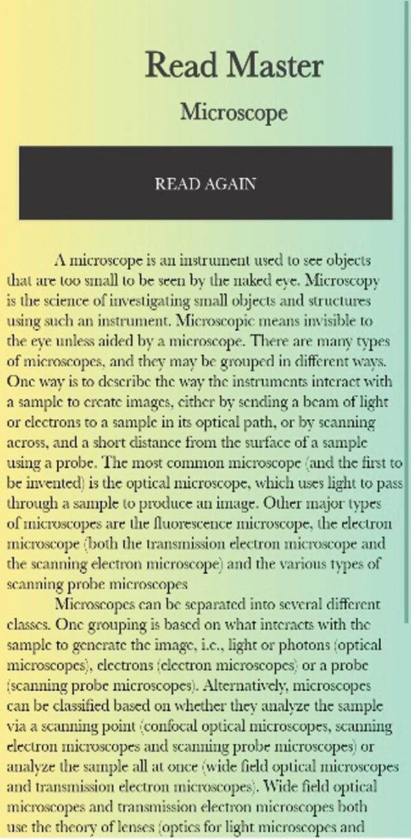
Figure 5: Reading
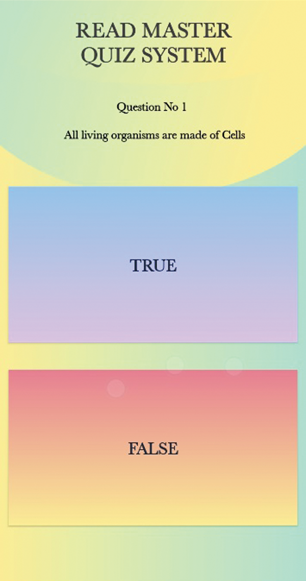
Figure 6: Assessment test
3.3 Data Collection and Sampling
Several data collection methods were used in our experimental design, including ethnography (observation) during the usage of the application as well as sessions to guide the user for experimentation and pre- and post-questionnaires with respondents. Data were collected from BVI users on the basis of pre-questionnaire responses. Finally, 56 BVI users were selected for the usability evaluation of the application and included in our research after discarding some irrelevant users based on pre-questionnaire.
All BVI participants had at least one year of smartphone usage experience, and their ages ranged from 18 to 40 years. The educational level of selected participants was secondary school to graduate. For the significance of this study, the author described in reference [29] that 20 to 30 users are considered valid from one geographic area with specific impairments.
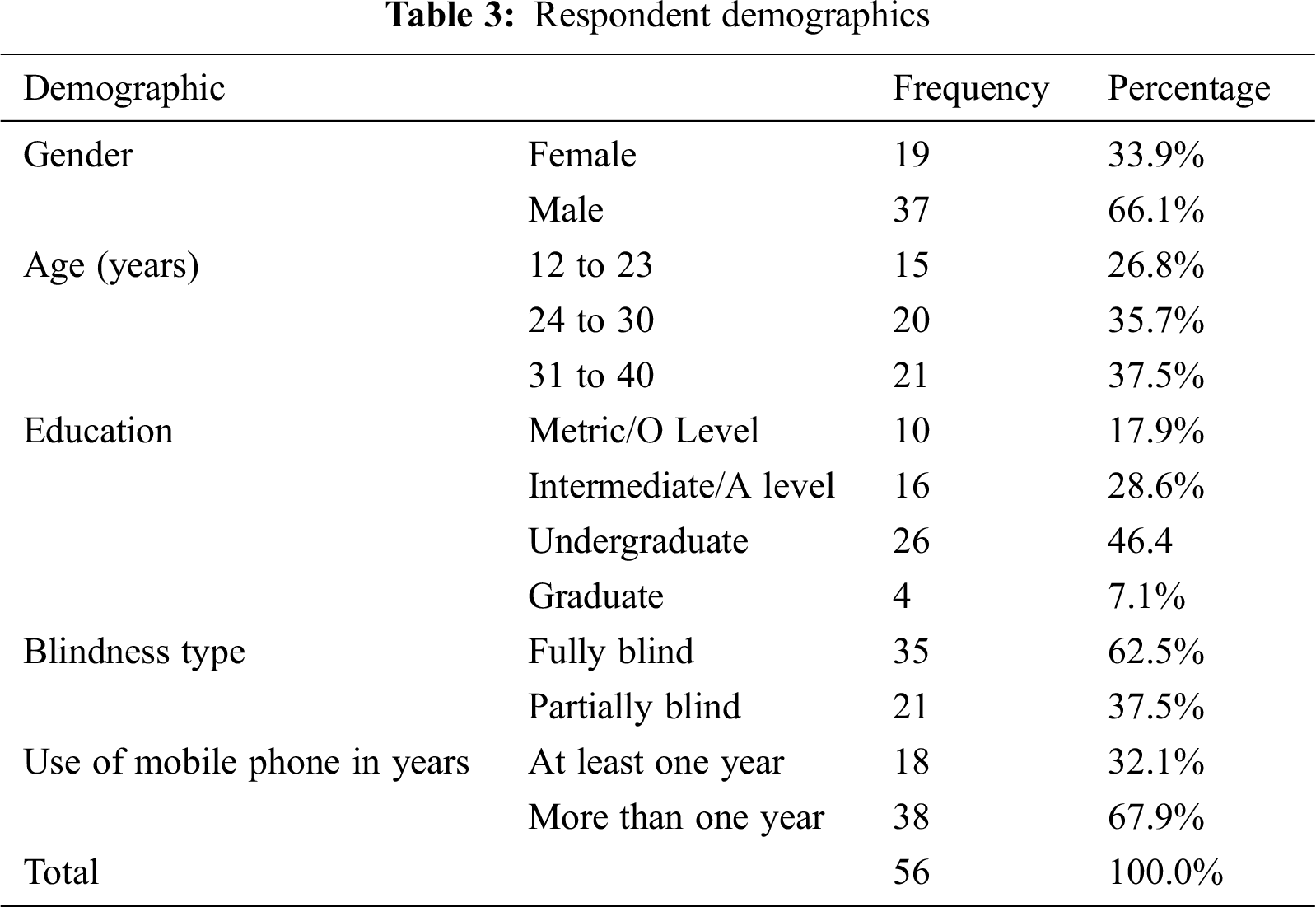
In this study, total of 56 BVI people participated in experimentation, among which 19 were females and 33 were males. Additionally, 35 were fully blind and 21 were partially blind. The ages of BVI participants were categorized as 12 to 23, 24 to 30, and 31 to 40. The smartphone experience level was categorized as either at least one year or more than one year, as shown in Tab. 3.
For the evaluation of satisfaction, a questionnaire was designed to collect the subjective categories of data. The questionnaire items related to satisfaction were designed and modified from literature.
The questionnaire design involved repeated confirmation steps. We first generated and developed initial items for the questionnaire through extensive reviews of prior studies. Initially, the questionnaire consisted of 15 items. Then we got a response from a panel consisting of an analyst, a user interface designer, and a graduate student. Based on the response of the panel, some of the items of the questionnaire were revised.
Finally, a questionnaire consisting of 10 items was designated to evaluate the user satisfaction of the educational mobile application. The measurement scale was a five-point Likert-scale that ranged from 1 (“strongly disagree”) to 5 (“strongly agree”).
In experimentation, four different tasks were assigned to BVI participants. These tasks included navigating the application, reading text information and listening to audio voice commands, taking the assessment test based on MCQs, and exploring different screens for best screen reader feedback. The tasks details are given below, and the average completion times are reported in Tab. 4.
In this task, BVI users were asked to navigate through the application. The main purpose of this task was to check the flow of tasks, structure of the application, and navigation (start, exit, back). The participants were directed to navigate from the main menu to any other menu of the application within the science section. The time allocated to complete this task was 5 minutes. The average completion time for tasks was 4 minutes.
3.5.2 Task 2: Avoidance of Redundant Information
Two activities were performed by BVI participants: searching a paragraph of text information, and listening to audio voice commands about the overall procedure to carry out the tasks. The objective of this task was to examine how well the application avoided listing redundant information presented on the navigation bar (page title/header) before detecting the page content. The other goal of this task was to overcome the conflict or crashing issues common with screen readers. The participants used the embedded screen reader, where a single tap to listen and a double tap to open a screen functionality was used. BVI participants were asked to use the application for 10 minutes. BVI users were keenly observed while using the application, and it was found that tasks were easy and simple to perform and less cognitive load was faced by BVI users.
3.5.3 Task 3: Serialization of Content
BVI users were asked to perform the assessment test, which was based on MCQs. The basic aim of this task was to pay consideration to the natural reading sequence and natural flow of tasks. It should take BVI users the same amount of effort to access the reading sequence for text and items as it takes non-BVI users during MCQ-based assessment. The time allocated for this task was 10 minutes, as 10 multiple-choice questions were provided and 1 min was given for each question. The users completed each question in less than 1 minute. The average time users took to complete the test was 6 minutes.
3.5.4 Task 4: Style and Text Presentation
In this task, users were asked to explore different tabs to reach the content reading screen from the MCQs screen. The main goal was to explore the layout, contents, and menus presentation on the screen of the application easily without extensive searching. BVI participants were asked to explore the different screens and tabs for about 16 min to reach the end. The average time to complete this task was 14.3 min.

The performance of the application was assessed based on effectiveness, efficiency, and satisfaction. Effectiveness and efficiency were measured by the ISO 9241-11 standard, whereas the system usability scale (SUS) was selected for post-task evaluation to determine the satisfaction level of BVI users.
Effectiveness is calculated by the given formula:
Efficiency is calculated by the given formula:
where N = Total number of tasks;
R = Total number of users;
nij = Result of task i by user j: when the task is completed, the value of nij is 1, otherwise;
nij = 0;
tij = Time spent by user j to complete task i.
The satisfaction of users was evaluated by using the SUS technique in this study. There were 10 short questions provided to BVI participants, which were scored on a Likert-scale that ranged from 1 (“strongly disagree”) to 5 (“strongly agree”) for post-task evaluations. In SUS, even-numbered questions were taken in a negative sense, whereas odd-numbered questions were taken in a positive sense. A score of 68 was considered as above average, 72 was ranked as good, and 92 was the best possible result.
This section will discuss the results of effectiveness, efficiency, and satisfaction for BVI users.
Effectiveness is related to the quality of informational content. Therefore, we calculated and compared the task-wise effectiveness of BVI users.
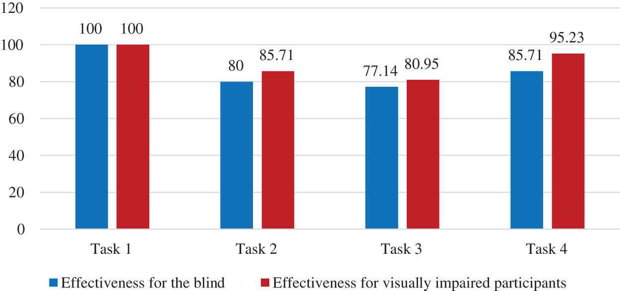
Figure 7: Effectiveness for the blind and visually impaired participants
Fig. 7, shows that the organization had 100% effectiveness for both blind and visually impaired users. It clearly shows that all the BVI users successfully performed task 1. However, in tasks 2 through 4, blind participants illustrated lower effectiveness than visually impaired participants. For the avoidance of redundant information, blind users had 80% effectiveness, and visually impaired users had 85.714% effectiveness.
Likewise, for serialization of content, blind participants had 77.143% effectiveness, compared to 80.95% among visually impaired participants. For style and text presentation, blind users had 85.71% effectiveness, and visually impaired users had 95.23% effectiveness.
Some authors suggested that efficiency and effectiveness are related to how quickly a user can complete a task. In this subsection, the efficiencies of BVI participants are displayed in Fig. 8.
The efficiencies of blind participants were lower compared to visually impaired participants for all tasks: 16.12% versus 25.48% for task 1, 10.14% versus 12.86% for task 2, 10.92% versus 12.03% for task 3, and 10.09% versus 11.04% for task 4.
Overall, the efficiency of visually impaired participants was better than blind participants.
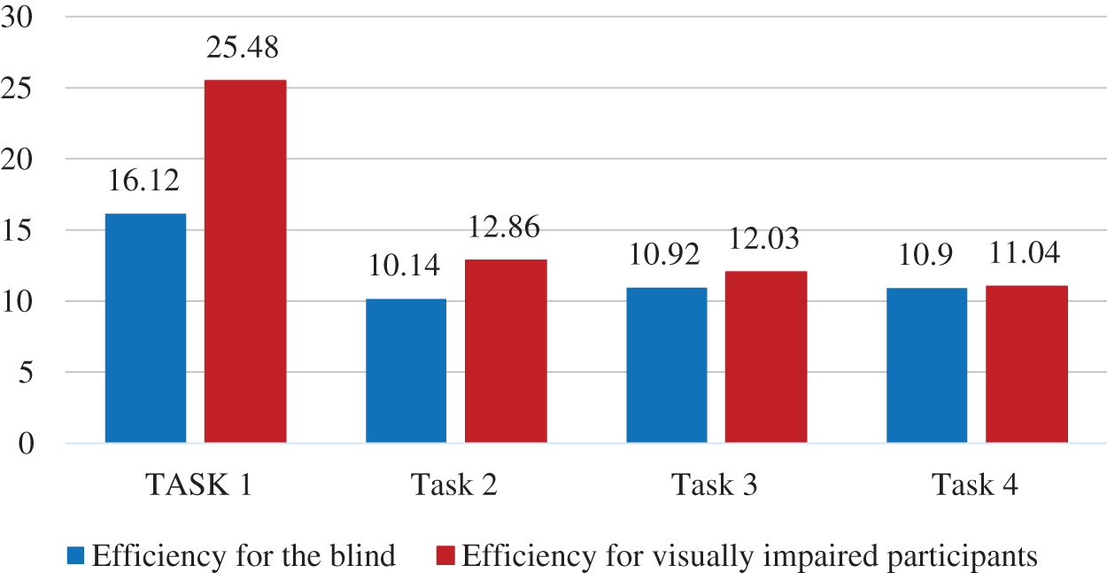
Figure 8: Efficiency for the blind and visually impaired participants
As previously mentioned, the SUS technique was used for data interpretation of satisfaction, where the results must be higher than 68 score points to indicate acceptable satisfaction with our mobile application. In this research, we have calculated the system usability score and average SUS score for BVI users.
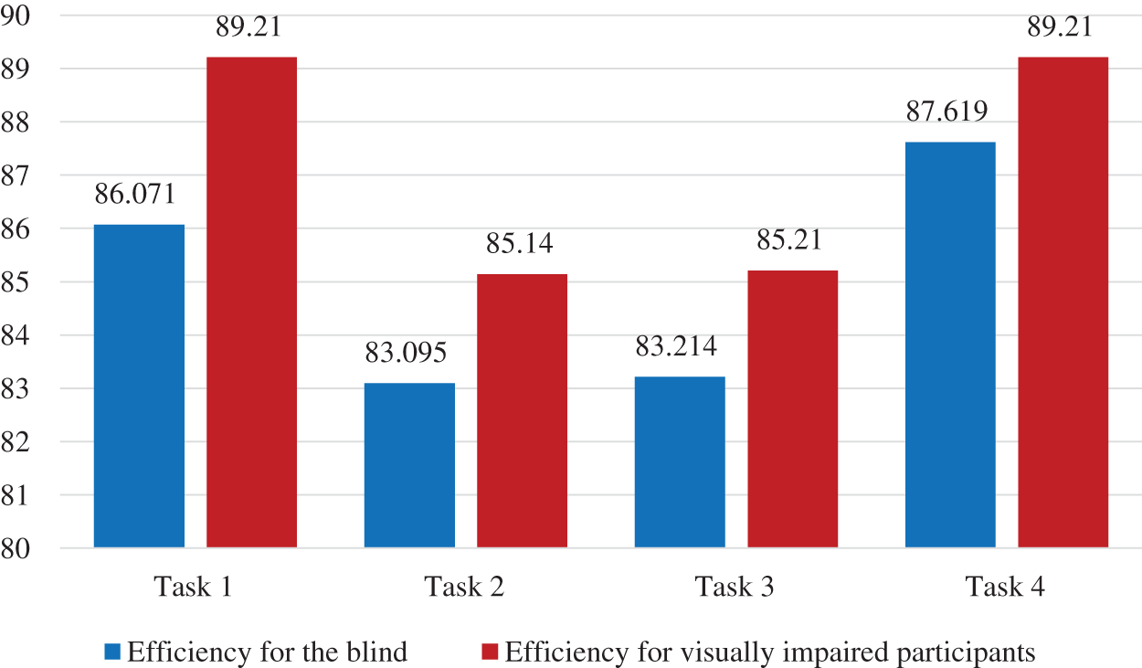
Figure 9: Satisfaction for the blind and visually impaired participants
In all four tasks, visually impaired participants had higher satisfaction levels than blind participants. The average SUS scores for visually impaired participants for all four tasks were recorded as 89.21%, 85.14%, 85.21%, and 89.21%, respectively, in Fig. 9.
Among the four tasks, the blind participants had the highest level of satisfaction with the presentation of the application, scoring 87.62 score points. The visually impaired participants had the highest level of satisfaction with both the organization and presentation of the application, with 89.21 score points.
Accessibility is the feature of services and products providing ease of use to individuals with special needs in getting the essential information or functionality of the service or product without any difficulty. This study identified the accessibility needs of BVI users in a mobile application user interface by creating an accessibility problems checklist for reducing the cognitive and informational load. This research followed the UCD process model to analyze the usability and accessibility of BVI users. This study divided the accessibility problems into organization, presentation, and behavioral categories. A smartphone android application incorporating solutions to the OPB problems was developed, and accessibility testing with BVI users was performed. In measuring the performance of the application, this study emphasized the usability evaluation.
Ethnography and system usability scale techniques were used for analysis and post-task evaluation. After solving the problems, we observed good user experiences for effectiveness, efficiency, and satisfaction. For the satisfaction level of the visually impaired participants, the highest system usability scale scores were recorded as 89.21 for task 1 and task 4, indicating these users had the greatest satisfaction with the organization and presentation of the application. Likewise, the organization of the application resulted in 100% effectiveness for both BVI users. However, the efficiency of visually impaired participants was better than blind participants. Hence, results indicate the high usability of the application, the increased satisfaction level of BVI users, and enhanced effectiveness and efficiency.
This research could have a significance impact on resolving OPB problems in mobile application interfaces for BVI users as it provides strategies and guidelines for developing BVI-friendly user interface designs with enhanced ease of use, efficiency, and satisfaction.
Acknowledgement: Thanks to our families and colleagues who supported us morally.
Funding Statement: The author(s) received no specific funding for this study.
Conflicts of Interest: The authors declare that they have no conflicts of interest to report regarding the present study.
1. L. Hakobyan, J. Lumsden, D. O’Sullivan and H. Bartlett, “Mobile assistive technologies for the visually impaired,” Survey of Ophthalmology, vol. 58, no. 6, pp. 513–528, 2013. [Google Scholar]
2. G. Kokkonis, V. Moysiadis, T. Kollatou and S. Kontogiannis, “Design tactile interfaces with vibration patterns in HTML5 for smartphone users with visual impairments,” International Journal of Multimedia & Its Applications, vol. 11, no. 1, pp. 01–09, 2019. [Google Scholar]
3. E. Giles and J. V. D. Linden, “Imagining future technologies e-textile weaving workshops with blind and visually impaired people,” in Acm Sigchi Conf. On Creativity And Cognition, New York, NY, United States, pp. 3–12, 2015. [Google Scholar]
4. M. C. Buzzi, M. Buzzi, B. Leporini and A. Trujillo, “Analyzing visually impaired people’s touch gestures on smartphones,” Multimedia Tools and Applications, vol. 76, no. 4, pp. 5141–5169, 2016. [Google Scholar]
5. A. Khan and S. Khusro, “Blind-friendly user interfaces–a pilot study on improving the accessibility of touchscreen interfaces,” Multimedia Tools and Applications, vol. 78, no. 13, pp. 17495–17519, 2019. [Google Scholar]
6. J. H. Park, H. Y. Kim and S. B. Lim, “Development of an electronic book accessibility standard for physically challenged individuals and deduction of a production guideline,” Computer Standards & Interfaces, vol. 64, no. 1, pp. 78–84, 2019. [Google Scholar]
7. I. Xie, R. Babu, T. H. Lee, M. D. Castillo, S. You et al., “Enhancing usability of digital libraries: Designing help features to support blind and visually impaired users,” Information Processing & Management, vol. 57, no. 3, pp. 1–10, 2020. [Google Scholar]
8. N. E. Guerrón, A. Cobo, J. J. S. Olmedo and C. Martín, “Sensitive interfaces for blind people in virtual visits inside unknown spaces,” International Journal of Human-Computer Studies, vol. 133, no. 3, pp. 13–25, 2020. [Google Scholar]
9. M. W. Iqbal, N. Ahmad, S. K. Shahzad, M. R. Naqvi and I. Feroz, “Usability aspects of adaptive mobile interfaces for colour-blind and vision deficient users,” International Journal of Computer Science and Network Security, vol. 18, no. 10, pp. 179–189, 2018. [Google Scholar]
10. R. Inostroza, C. Rusu, S. Roncagliolo, C. Jimenez and V. Rusu, “Usability heuristics for touchscreen-based mobile devices,” in IEEE Ninth Int. Conf. on Information Technology-New Generations, Las Vegas, NV, USA, pp. 662–667, 2018. [Google Scholar]
11. C. Shneiderman, M. Plaisant, S. Cohen, S. Jacobs, N. Elmqvist et al., Designing the user interface: Strategies for effective human-computer interaction, Pearson, 2016. [Google Scholar]
12. A. Vance, C. Elie-Dit-Cosaque and D. W. Straub, “Examining trust in information technology artifacts: the effects of system quality and culture,” Journal of Management Information Systems, vol. 24, no. 4, pp. 73–100, 2014. [Google Scholar]
13. D. Cyr, “Website design, trust and culture: An eight country investigation,” Electronic Commerce Research and Applications, vol. 12, no. 6, pp. 373–385, 2013. [Google Scholar]
14. R. Calvo, A. Iglesias and L. Moreno, “Accessibility barriers for users of screen readers in the Moodle learning content management system,” Universal Access in the Information Society, vol. 13, no. 3, pp. 315–327, 2013. [Google Scholar]
15. B. Leporini, M. C. Buzzi and M. Buzzi, “Interacting with mobile devices via voiceover: Usability and accessibility issues,” in 24th Australian Computer-Human Interaction Conf., Perth, Australia, pp. 339–348, 2012. [Google Scholar]
16. O. Gaggi, G. Quadrio and A. Bujari, “Accessibility for the visually impaired: State of the art and open issues,” in 16th IEEE Annual Consumer Communications & Networking Conf., Las Vegas, NV, USA, pp. 1–6, 2019. [Google Scholar]
17. Y. Lee and J. Lee, “A checklist for assessing blind users’ usability of educational smartphone applications,” Universal Access in the Information Society, vol. 18, no. 2, pp. 343–360, 2017. [Google Scholar]
18. C. M. N. Faisal, M. G. Rodriguez, D. F. Lanvin and J. D. A. Suarez, “Web design attributes in building user trust, satisfaction, and loyalty for a high uncertainty avoidance culture,” IEEE Transactions On Human-Machine Systems, vol. 47, no. 6, pp. 847–859, 2017. [Google Scholar]
19. D. P. Khairnar, R. B. Karad, A. Kapse, G. Kale and P. Jadhav, “Partha: A visually impaired assistance system,” in 3rd IEEE Int. Conf. on Communication System, Computing and IT Applications, Washington, DC, USA, pp. 32–37, 2020. [Google Scholar]
20. N. Neto, P. Escudeiro, B. Galasso and D. Esdras, “Development of an inclusive multiplayer serious game for blind and deaf,” in 15th IEEE Iberian Conf. on Information Systems and Technologies, Sevilla, Spain, pp. 1–6, 2020. [Google Scholar]
21. F. A. Muqbali, N. A. Tourshi, K. A. Kiyumi and F. Hajmohideen, “Smart Technologies for Visually Impaired: Assisting and conquering infirmity of blind people using ai technologies,” in 12th IEEE Annual Undergraduate Research Conf. on Applied Computing, Dubai, United Arab Emirates, pp. 1–4, 2020. [Google Scholar]
22. A. Aqle, K. Khowaja and D. Al-Thani, “Preliminary evaluation of interactive search engine interface for visually impaired users,” IEEE Access, vol. 8, no. 8, pp. 45061–45070, 2020. [Google Scholar]
23. A. A. D. Toro, S. E. C. Bastidas and E. F. C. Bravo, “Methodology to build a wearable system for assisting blind people in purposeful navigation,” in 3rd Int. Conf. on Information and Computer Technologies, San Jose, CA, USA, pp. 205–212, 2020. [Google Scholar]
24. R. S. Germano and M. A. Eliseo, “Acceasy-a front-end framework prototype for developing responsive web applications with accessibility for visually impaired people,” in 15th IEEE Iberian Conf. on Information Systems and Technologies, Sevilla, Spain, pp. 1–6, 2020. [Google Scholar]
25. L. Oksana, T. Ihor and L. Pavlo, “Navigation assistive application for the visually impaired people,” in 11th Int. Conf. on Dependable Systems, Ukraine: Services and Technologies, Kyiv, pp. 320–325, 2020. [Google Scholar]
26. L. P. Sousa, R. M. Veras, L. H. Vogado, L. S. B. Neto, R. R. Silva et al., “Banknote identification methodology for visually impaired people,” in Int. Conf. on Systems, Signals and Image Processing, Niterói, Brazil, pp. 261–266, 2020. [Google Scholar]
27. J. Salminen, S. G. Jung, S. Chowdhury, S. Sengün and J. J. Bernard, “Personas and analytics: a comparative user study of efficiency and effectiveness for a user identification task,” in CHI Conf. on Human Factors in Computing Systems,Association for Computing Machinery, New York, NY, United States, pp. 1–13, 2020. [Google Scholar]
28. P. K. Chilana, A. J. Ko and J. Wobbrock, “From user-centered to adoption-centered design: a case study of an hci research innovation becoming a product,” Proc. of the 33rd Annual ACM Conf. on Human Factors in Computing Systems, vol. 1, no. 1, pp. 1749–1758, 2015. [Google Scholar]
29. J. Lazer, J. H. Feng and H. Hochheiser, “Research methods in human computer interaction,” A JohnWiley and Sons, vol. 1, no. 1, pp. 1–153, 2017. [Google Scholar]
 | This work is licensed under a Creative Commons Attribution 4.0 International License, which permits unrestricted use, distribution, and reproduction in any medium, provided the original work is properly cited. |