DOI:10.32604/iasc.2021.016263

| Intelligent Automation & Soft Computing DOI:10.32604/iasc.2021.016263 |  |
| Article |
Designing an Online Appointment System for Semiliterate Users
1Department of Computer Science, Bahria University Lahore Campus, Punjab 54600, Pakistan
2Department of Software Engineering, University of Gujrat, Punjab 50700, Pakistan
*Corresponding Author: Ansar Siddique. Email: dr.ansarsiddique@uog.edu.pk
Received: 28 December 2020; Accepted: 14 February 2021
Abstract: Information and Communications Technology (ICT) has revolutionized the healthcare leading to provision of eHealth facilities remotely. During the peak time of COVID-19, as the long queues at health care facilities can result in spread of the virus. ICT can play an effective role especially for reducing the extended waiting time of patients to consult a medical practitioner which is considered as a source of hazard during the pandemic. However, in developing countries where majority population is semiliterate so find difficulty when come into contact with appointment systems which are not particularly designed keeping in consideration the requirements of semiliterate users. It is extremely important to better understand how to design user interface which allow semiliterate users to effectively perform the tasks. So there is a dire need to develop a simple, effective, easy to learn user interface (UI) of an online appointment system for the productive doctor-patient consultation. Therefore, this study aimed to providing an effective user interface of web based online appointment system to semiliterate users through User-Centered Design (UCD) methodology. To achieve this, a prototype was designed to overcome issues in the existing appointment systems gathered through a field study. The needs and expectation for semiliterate users were fulfilled by incorporating the requirements of UI development for the target users. A sample of forty-two semiliterate users was used to evaluate the prototype. The evaluation results showed that semiliterate users’ performance measured using—effectiveness, efficiency and satisfaction significantly improved while interacting with the prototype as compared to existing interfaces. The effectiveness is measured through number of errors and tasks accomplished in UI, efficiency by the time required to complete the task and satisfaction by System Usability Scale (SUS). The SUS score improved from 50.8 to 77.6 for the prototype.
Keywords: Information and communication technology; human-computer interaction; user-centered design; e-health; semiliterate users
The advancement in Information and Communication Technology (ICT) has revolutionized the various sectors such as such as healthcare, agriculture, education, defense, media, manufacturing, and many others in delivering services effectively to the stakeholders [1]. The prevailing situation of Corona Virus Disease (COVID-19) stressing the importance of technology innovation in providing the safe and effective health care services in order to support good health and prevent population from the infection [2]. However, adapting to ICT solutions is still a challenge as most of the applications provide textual interfaces which are difficult to be comprehend by semiliterate users [3]. A large number of world population is consisting of semiliterate people which are almost 773 million of world populace, mostly living in developing countries [1]. The term ‘semiliterate’ means a person who is unable to read or write with ease or fluency [4]. A great number of computer application present an ease of access challenge to those who are unable to read fluently. The hefty use of text over the interfaces of computer applications make it difficult to access such applications especially for those who are semiliterate. A major obstacle in delivering service through ICT means is that the large number of user are semiliterate [5]. On the other hand physical access and interaction to service providers has been abated due to COVID-19 pandemic as it spread from human to human by droplets or by direct contact and has taken the death toll to millions across the globe [6, 7]. To curtail the infection, strategies including smart lockdown and social distancing were practiced by most of the countries [8]. These circumstances have resulted in restricted access to basic facilities for humans including basic healthcare facilities where access to hospitals is limited, due to fear of the pandemic. However, some patients who require medical consultations during the pandemic need to follow guidelines specified by the authorities and practice the precaution steps while waiting for their turn. ICT has provided various solutions for eHealth, varying from containment of the COVID-19, prescription, awareness to facilities. Patient overcrowding due to medical appointments can result in the spread of coronavirus and to avoid this situation there is an urgent need of an Online Appointment System (OAS). Although many hospitals and polyclinics offered facility of an OAS but it is difficult for users to book appointment through these systems. As majority of the population (i.e., around 60%) of developing countries (e.g., Pakistan) resides in rural areas which have poor literacy skills as well as they avoid the use of technology. Their major interaction with technology is the use of phones for synchronous voice communication [9]. They are not as effective as literate people so remain unable to book an online medical appointment which indirectly caused increasing health issues due to untreated illness and improper medication consumption without doctor’s consultation. The design of existing OASs does not accommodate the limitations of semiliterate that is why they can’t directly interact with them and always rely on external assistance to perform the task. Only less than 40% of the population of developing countries can take benefit from such OASs. In the presence of innovative digital technologies, patients in rural areas and those who do not have access to healthcare professionals in remote areas of developing countries cannot be relegated to a powerless position. As per author’s knowledge, so far, there is limited research is available on designing healthcare systems especially OAS for rural semiliterate community [10]. It has shown through research that semiliterate users varied from literate user with respect to their low cognitive processing speed, low memory, ICT skills and low ability to process language. Language barrier becomes a major constriction for semiliterate user while accessing digital service including healthcare services, banking services and other online services. Moreover, the literate and semiliterate population of developing countries is different from each other in terms of their life experiences, expectations, needs and difficulties. It will not be favourable to imitate the western-centric interface, symbols and feature without analysing in detail the requirements of semiliterate users of developing countries. The use of multimedia (i.e., images, audio, animations and graphics etc.) to design interfaces can potentially facilitate the semiliterate users [9]. This research premised on the belief that if the user interfaces designed well, user would not have any need of formal literacy, ICT skills or external aid to operate the computer applications. Therefore, the primary objective of this study is to provide useful online appointment system to the semiliterate users, with a user interface designed in such a way that semiliterate users required absolutely no external assistance from any person at all to operate. To achieve this goal, user cantered design methodology was employed in order to understand and accommodate the needs of semiliterate users and to design corresponding prototype that was also evaluated by semiliterate users in real environment. The major research questions investigated during this study are as (i) How to design interfaces for semiliterate population of developing countries? (ii) What particular challenges involved in the design of interfaces for the semiliterate user of developing countries? (iii) How the interface product could be developed especially for semiliterate users? (iv) How the interfaces designed considering the needs of semiliterate facilitate them?
Rest of the paper is organized as follows: Section 2 presents the literature relevant to online appointment systems. Section 3 is about the research methodology. In section 4 we present and discuss the findings of this study. In section 5 the recommendations related to interface design are presented. Finally, in section 6 we give our conclusion and future work.
It has been shown through research that semiliterate users get easily confused and distracted while working with software application especially information intensive applications such as web based ones. They usually took more time and longer steps to complete the task as well navigate slowly the desired pages in comparison to those users who are high literate. Several research initiatives have been taken to design OAS for semiliterate users in developed countries. As an OAS was introduced in 40 different healthcare institutions in Lithuania and the system increased the effectiveness of healthcare management. The system has numerous advantages for the patients and is being steadily utilized [11]. In Denmark, a public health portal enables online medical appointment scheduling for patients which benefited the management where appointment confirmation was performed via e-mail relieving them from being bound to phone calls [12]. Positive feedback was received from patients using an online appointment booking system in Estonia, East Tallinn Hospital [13] where the system was regarded as convenient as the appointment can be booked from any location. This finding is consistent with that found by [14] where web-based online appointment system of China’s Xijing Hospital was preferred as compared to the traditional queuing method due to lesser waiting time which increased patients’ satisfaction level. Likewise, a renowned hospital in Uganda has also launched an OAS [15]. The Spanish Government launched an initiative to implement online appointments to all healthcare centres in Spain where12 million online appointments were recorded with 3,321 registered healthcare centres and 86% of the citizens as the users [16]. A study [17] in China claimed that patients have complained multiple times about the long outpatient registration queue to book an appointment with a healthcare professional. On the contrary, patients portrayed a positive attitude towards the advantageous online appointment system. A study [18] carried out in Iran, a developing country highlighted the importance of web-based OAS to overcome the long waiting time of patients and increased administrative paperwork. The research was supported by the Iran Ministry of Health where the system was encouraged to be implemented at a larger scale. In another study, existing Indian OAS were analysed, usability issues were identified and a model for improvement was proposed [11]. A framework was proposed where both urban and rural populations to be facilitated for e-health services including the appointment booking service with a doctor [19]. Meanwhile, in another similar study [20] an approach to provide OAS facilities for remote communities in developing countries was presented. Dissemination of e-health services in developing countries specifically on the appointment with doctor modules for patients using cloud services was also researched [21].
In Pakistan, e-health services evolved from telemedicine in 1998 in Northern areas. It composed of different communication modalities comprising of video conferencing, web-based communication systems, and telephone services that were used during the treatment and management of injured patients and their rehabilitation due to earthquake in 2005 [22]. Electronic Health Record (EHR) is also being implemented in Pakistan where the Indus Hospital was the first hospital to implement EHR [23]. Meanwhile, Shaukat Khanum Memorial Hospital [20] uses ORACLE hospital management information system. The Punjab Information Technology Board (PITB) [24] is a government institution working towards the digitization of health, agriculture, education, and other sectors in Pakistan. A great work has been carried out in the field of e-health by PITB including systems such as e-vaccination, disease surveillance, dengue activity tracking, biometric attendance for health facilities, polio monitoring, drug inspection and evaluation, drug testing and laboratory automation, hospital and health watch. Many hospitals in Pakistan offer online appointment facility via their websites and start-up companies are also working consistently to develop OAS for facilitating users [25]. Healthcare is one of the sectors given priority for digitization for the benefit of the community. OAS facility are also provided by various organizations. The author [10] observes that the healthcare access has become easier than it has ever been before, as providing facilities of the OAS. One of the main benefits of these applications is to use it for patient appointments. The paper states the statistics that in Pakistan and abroad more than 1.5 million users use these websites. These websites are beneficial to the community. However, the previous work done so far mainly emphasized to provide online appointment facility to the mainstream population. The research on user interfaces (UI) specifically UI of OAS for semiliterate users is limited. There is a need to accommodate the needs of 60% urban population specifically to assist the semiliterate users in the digitized UI interfaces in OAS domain [10]. They should also take the benefits of these systems. In our research, semiliterate users were studied with regard to user interfaces and a prototype of OAS was designed to measure their performance and satisfaction.
Human-Computer Interaction (HCI) has played a vital role in designing interactive products. User Centered Design (UCD) is one of the commonly used development methods in HCI for building interactive user interfaces. UCD process helps designers to understand the users’ requirements expectations from an interactive product. The needs and expectation such as easy-to-use, easy to remember, effective and efficient interfaces, there could be many other needs which depends on the segment of population that is under study. UCD requires much effort, time and though to create an interactive product because this process involves potential users in the design process, get their feedback on everything from feel of interface to use of interface with ease and efficacy. Resultantly, UCD creates a usable, appealing and successful interactive product [26]. It is therefore, UCD is known as a methodology which enables useful, usable, and satisfying healthcare technology applications. Several studies have utilized UCD approach to design e-health interfaces [27–29]. In this study, UCD was applied for the development of OOBS.
According to the ISO 9241-2010 [30] standard on UCD, four important steps should be undertaken to incorporate usability requirements of semiliterate users into the design of online appointment systems. Such four steps are as follows:
i) Understanding user and context of use
ii) Specifying the user requirements
iii) Producing design solutions
iv) Evaluating the design
In the first phase, subjects were requested to use the existing interfaces for an appointment with their medical specialist. At the end of users’ interaction with the original interface, user’s suggestion, feedback, and design recommendations were acquired. In the next phase, a prototype was developed and evaluated by the semiliterate users. Both existing and proposed interfaces were compared to evaluate usability. Further explanation of these steps is as follows.
3.1 Step 1-Understanding User and Context of Use
End users have specific objectives to use a system. Therefore, in order to accommodate the users’ requirements into the system, the UCD process was utilized. The development of a system begins with an understanding of semiliterate users’ needs and expectations with regard to usability. The aim of this phase is to understand as much as possible about the users, their work and the context of that work so the system being designed can aid them in achieving objectives.
3.2 Step 2-Specifying User Requirements
This step is intended to collect user requirements as well as discover usability issues exist in existing interfaces with respect to semiliterate users. The ultimate objective of this stage is to develop from the needs identified, a set of stable requirements that establish a sound basis to make progress into thinking about design activity.
3.3 Step 3-Producing Design Solutions
This step is meant to design a prototype in order to cater the needs of semiliterate users and usability issues they face while interacting with interfaces of existing websites designed to make online medical appointments. The prototype allows semiliterate users to interact with proposed interactive product to explore intended uses as well as get some experience of using it in a real environment.
The last step is performed to evaluate the envisioned product that users can use the product and how they feel and experience about it. Moreover, this step is intended to evaluate the performance of semiliterate users in comparison to existing to interface through different metrics. The user experience is measured using different standard instruments.
The findings of the steps discussed above are discussed below.
In this phase, the functionality of the system concerning tasks to perform and the selection of users was conducted. The findings of this this phase are as follows.
4.1.1 Literacy Levels of Users
School-based education is compulsory and free of charge for the first ten years in Pakistan. Traditionally, the education system specifically in Pakistan is divided into pre-primary (until class 2), primary (until class 5), and middle (until class 8) [31]. In this study, participants were divided into three categories as shown in Tab. 1. the users who completed: (i) pre-primary, (ii) primary, and (iii) middle education.
Table 1: Categorization and literacy levels of participants

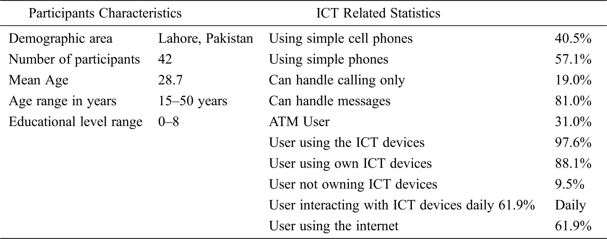
The purpose of this study was to evaluate different interfaces from the semiliterate users’ perspective. Therefore, our target subjects were the people neither completely illiterate (absolutely cannot read or write) nor properly literate (beyond the middle education). The pre-experiment questionnaire was distributed among participants to evaluate their traditional literacy skills and acquaintance with technology. The questionnaire was translated into users’ native language, Urdu. Its validity was verified by an Urdu language as well as by an HCI expert. The subjects participated voluntarily in this study. The selection of participants includes snowball sampling. Employees from a university, a nearby hospital, and workers from a construction company participated in the experiment conducted in a metropolitan city, Lahore. Participants’ demographic characteristics and acquaintance with technology are displayed in Tab. 2.
Table 2: Demographics and ICT related statistics of the participants
Before the commencement of the experiment, the participants were briefed. Participants were also given additional time to get acquainted with the system. There were three steps in the experimentation process:
• The first step was to complete a pre-experiment questionnaire, to know the users’ literacy levels and previous exposure with the technology.
• The second step was to accomplish some tasks on the existing OAS, a locally designed website for online medical appointments. It was divided into sub-tasks require to be performed to make an appointment.
• The last task was about the completion of the questionnaire to determine the users experience.
The experimentation procedure was followed to collect users’ usability issues with the existing interface. The following steps were implemented for the collected requirements.
4.2.1 Experimental Setup and Procedure
The study was conducted at different organizations (university, hospital, construction company). All the laptops used during the experiment were homogenous concerning the operating system. All the participants received oral and written information about the project and their participation was voluntary. The participants were given a consent form and were guided, and if they felt uncomfortable at any point they could withdraw without any reason. The questionnaire assisted in identifying user ability to interact with technology. All users were informed at the beginning of the study that if they do not feel comfortable with the experiment, or if they feel it is beyond their capability, or due to any other reason they decided to quit from the experiment at any stage, the questionnaire should not be submitted and mentor should be informed. The participants were also requested about their experience of using ICT devices for research purpose. Nineteen participants were excluded from the study based on the pre-experiment questionnaire. Five guards of a university and two janitors were found completely illiterate. One café employee and a maid from university refused to take part in the study due to the unfamiliarity of technology. Three laborers were excluded from the study as they were confused about the basic interaction with the keyboard and mouse. Seven female participants were intimidated during the study and were excluded. Overall, the number of women was less than the number of men due to a limited number of women working in organizations and construction sites, however, the male-to-female ratio was similar among the selected groups.
4.2.2 Usability Evaluation of Interfaces
According to ISO 9241-11, usability is defined as the “the extent to which a system, product, or service can be used by specified users to achieve specified goals with effectiveness, efficiency, and satisfaction in a specified context of use” [32]. In this study, four usability metrics based on Nielsen [33] criteria for measuring usability were used. These include task completion time, number of errors, number of tasks accomplished and satisfaction. The afore mentioned metrics were used to measure the usability. Upon completion of tasks, users’ interaction and satisfaction with the interface was also determined. User satisfaction was measured using the System Usability Scale (SUS) [34] and After Scenario Questionnaire (ASQ) [35].
4.2.3 User Interaction with Existing Interfaces
The users were not interrupted during the task performance, however, each user was closely observed by a mentor. The mentor was present to guide the users and ensure smooth experiment.
The users were given an existing interface to perform various tasks to make an appointment with a medical practitioner. Semiliterate users were observed for the following difficulties:
a) Language Difficulty: Users were unable to understand the terms as “speciality” or “name of diseases” as the interface content was not in the native language which was a hurdle for the semiliterate users.
b) Typing Issue: Users felt difficult in typing rather than clicking the interface.
c) Navigation Issues: Due to complex website structure, participants clicked the interface wrongly multiple times.
d) Email literacy: The users were unable to understand the email address.
e) Other issues: Users were unable to read the name of cities and find the required city during the task performance. Most users were clicking the wrong item when they were directed to perform the respective task.
The graph in Fig. 1. illustrates the statistics of usability issues faced by the semiliterate users during interaction with existing interface. These usability issues identified the areas to be taken into consideration for the development of prototype. The most frequent issue faced by the users is in understanding the specific terminologies of specialties and to input the email id.
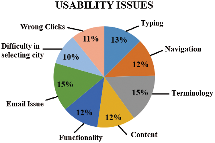
Figure 1: Usability issues faced by semiliterate users
The prototype was developed to overcome the usability issues highlighted when interacting with the existing interface. It was designed in a way that semiliterate users can have a clear understanding of how to interact with the interface easily. The bootstrap framework was utilized for the development of the prototype. A high-fidelity prototype was created through HTML and JavaScript. The main page of the website was kept simple with all the functional aspects (i.e., Selecting specific specialty to make an appointment, Selecting specific doctor to make an appointment and Apply for online consultation with a doctor) provided on the navigation pane of the website to reduce the complexity of web structure as illustrated in Fig. 2. Navigation was linear with the absence of hierarchical structure. The tasks to perform were made concise and simple. The webpage was designed in the native language, Urdu. Hand-drawn icons were created for selecting a specialty to assist the semiliterate user as they can easily comprehend the hand-drawn. A real image of a person was displayed and when clicked, vocal assistance was provided to the user to decrease the textual content in the system and assistance in the form of real-life images was integrated.
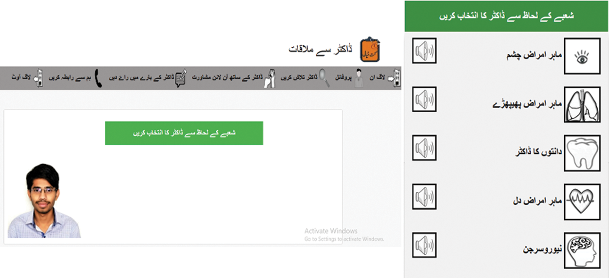
Figure 2: Screenshot of the main page of the prototype
On clicking the selection of specialty, a hand-drawn speaker icon provides text to speech functionality. If the semiliterate users were unable to read correctly, they can click the speaker icon for audio support as depicted in Fig. 3. Icons were provided along with caption and audio facility. After clicking the required specialty, the user was directed to the webpage of a list of doctors available. Here, only the required timing and book an appointment buttons were present. Less text was appreciated as it is easy for semiliterate users to comprehend. Real life pictures of doctors and localization of text was provided to capture the attention of the target participants.
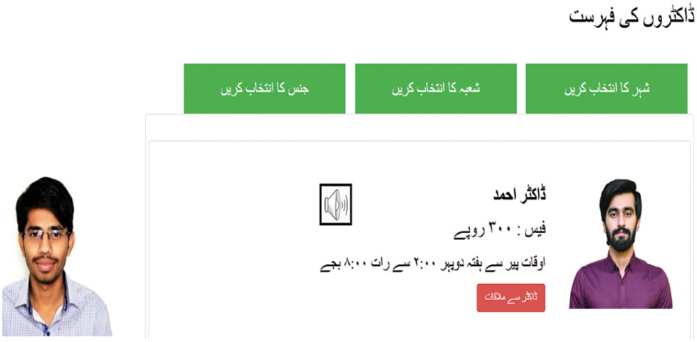
Figure 3: List of doctors for an appointment
After the selection of a doctor, the user was directed to the screen of booking date and time. Here, the semiliterate user was provided with audio support and short video support to perform the task as illustrated in Fig. 4. The next UI was directed for selection of time for an appointment with a doctor. Here, the number of clicks was reduced. As the user clicks the time, participant was automatically directed to the next tab of entering the participant’s phone number. The tasks breath was shortened by providing one webpage with embedded tabs to complete the tasks.
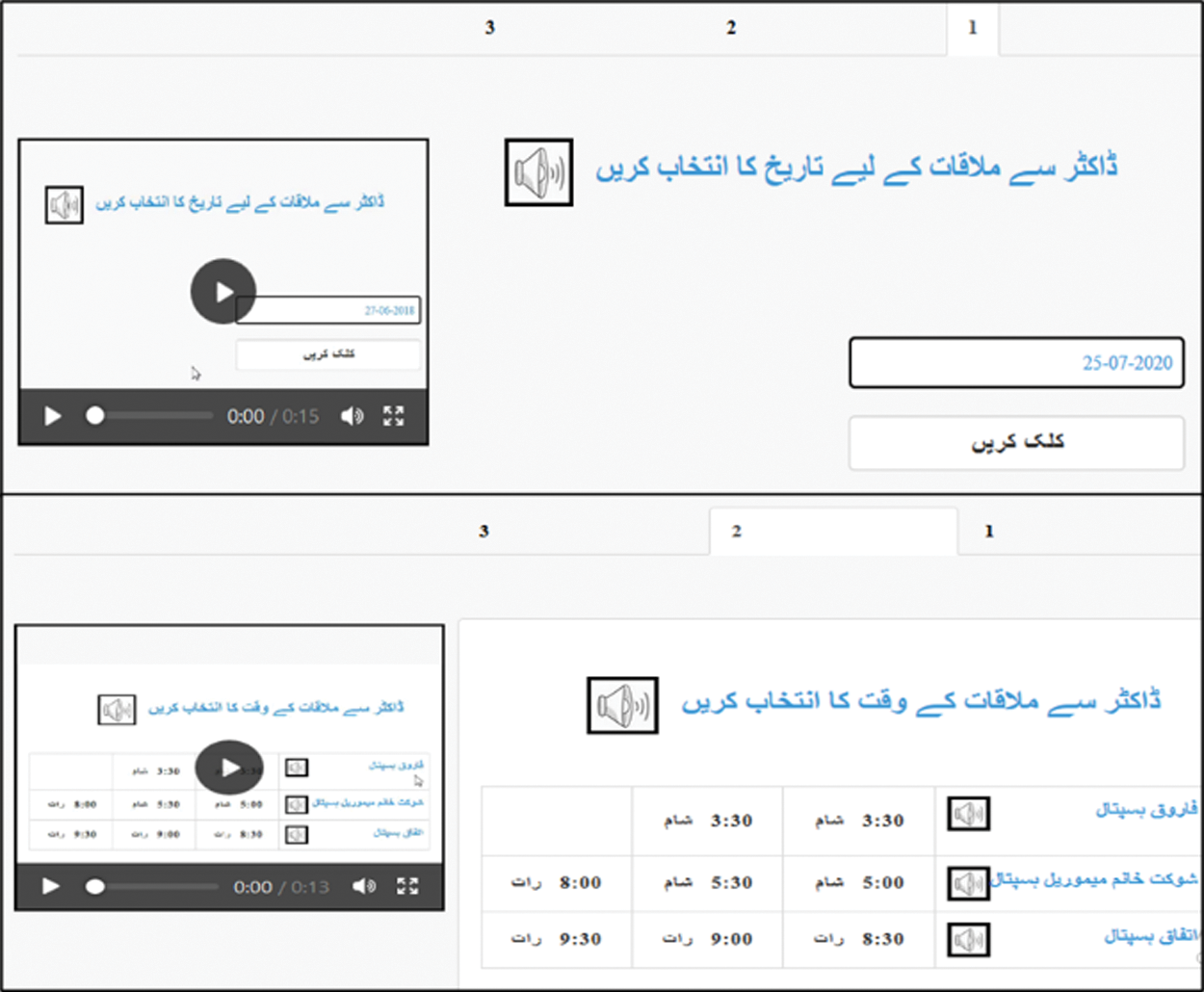
Figure 4: Appointment with a doctor
The user was provided with the interface to add user phone number in digits. When the “Submit” button was clicked, the user was directed to the UI of task accomplishment of appointment with a doctor. The user may provide feedback once a message indicating the completion of the task with audio support was displayed.
The login process was made as easy as possible. The original interface requires an email ID and setting of a password. However, in this prototype the user entered his/her phone number and a code was generated by the SMS server and sent to the phone. Now, the user can enter their code and gets logged in to the website. Therefore, the interaction complexity was reduced. During the registration, the ‘login’ module. The input of city was in form of selection of pictures as shown in Fig. 5. The cities were indicated by the famous places of which cities were recognized. Therefore, the mental model concept for semiliterate user was implemented.
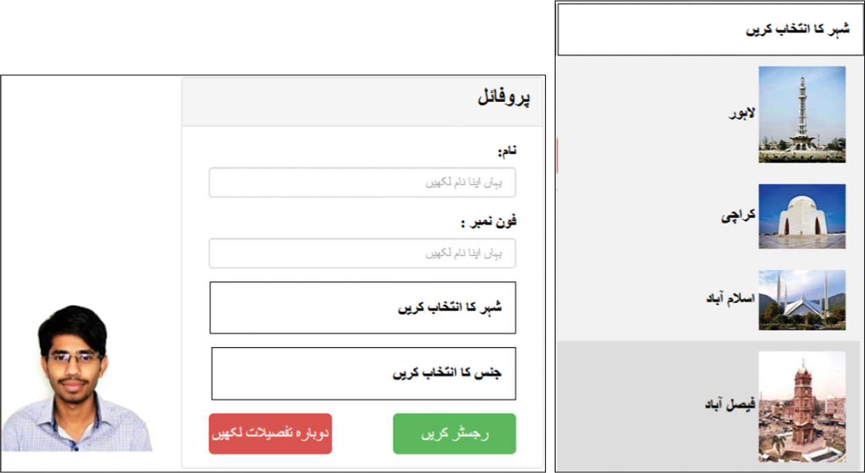
Figure 5: Login UI of prototype
The prototype also provided the facility of online consultation with doctor. Consistency was maintained between the screens illustrated in Fig. 6. Same colors and pattern was followed in UI design. The input automatically directed the user to the next tab for the completion of the task. Maintaining the consistency video support was provided at each UI. In order to provide less interaction with the interface the users were provided with recording module to record their disease and input the number to be contacted for later use.
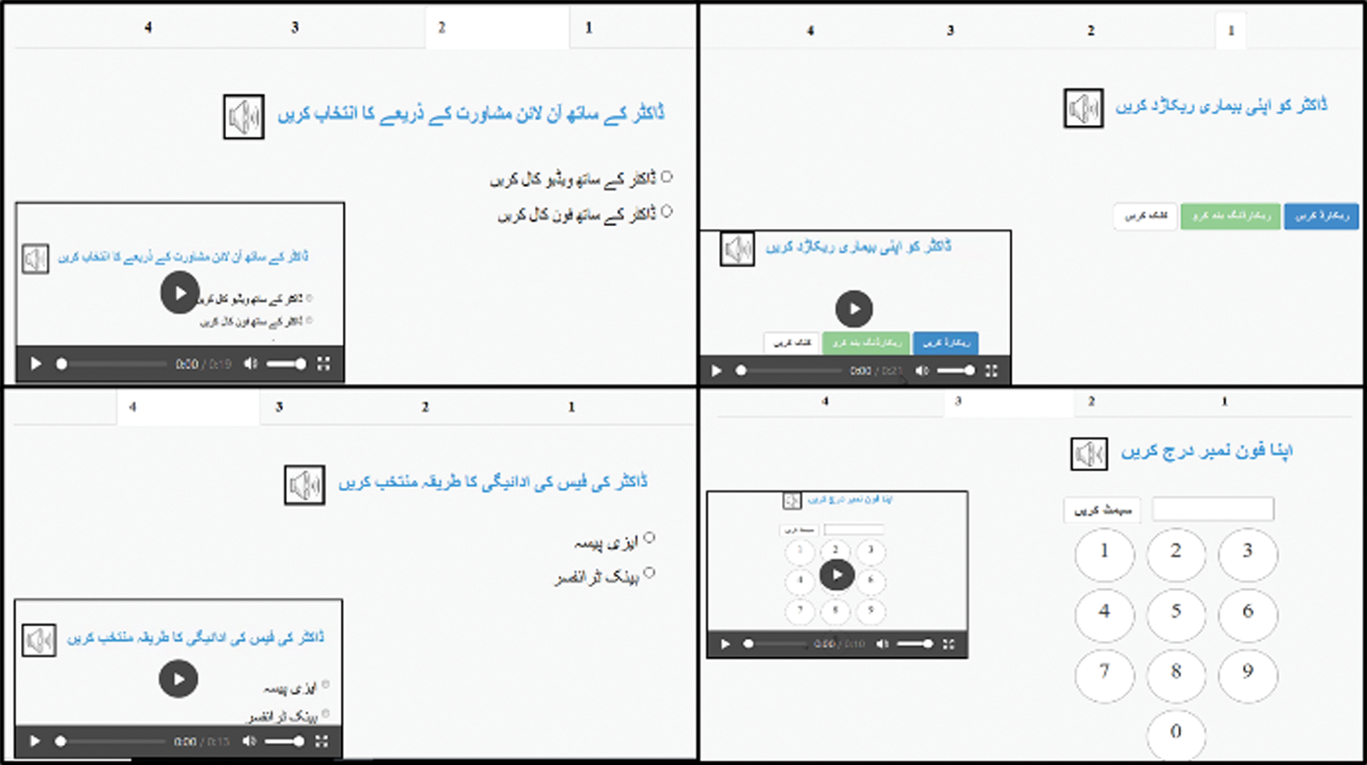
Figure 6: Online consultation with doctor
The usability of interfaces was compared between the existing and prototype interfaces. The parameters of Task Time, Number of Errors, Task Accomplished and Satisfaction through SUS and ASQ were analyzed.
For task completion, it was observed that the users entered valid data. If any field in the interface is incomplete, empty, filled with invalid data or makes no sense then it is not considered complete, e.g., numerical values in name or email address without proper structure. In the existing interface, only 55.1% of the total tasks were completed by the users while in the prototype 83.7% tasks were completed. Fig. 7. shows the comparison of the results between the existing interface and prototype of accomplishment of the tasks. The graph illustrates the comparison of the percentage of tasks accomplished by basic, moderate and expert user categories of each group. An independent sample T-Test was conducted that shows the statistical significance (t(2) = 8.4 > Tcrit(two-tail) = 4.3, P-value < 0.05) and reject the null hypothesis that the tasks completed by all the users in existing interface and prototype are equal.
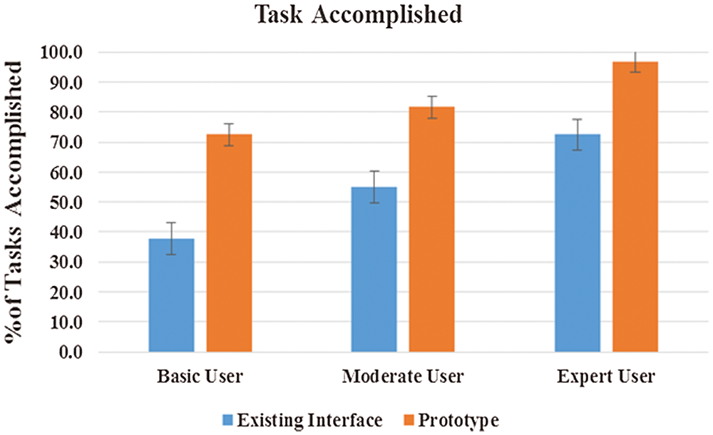
Figure 7: Percentage of tasks completed by each category of users for OAS
The error metric measures the number of errors that occurred during a participant’s performance of the test tasks. The errors included wrong clicks, wrong input. t-Test was conducted shows statistical significance (t(2) = 4.5 > Tcrit(two-tail) = 4.3, P-value < 0.05) and rejects the null hypothesis that the number of errors by all the users in existing interface and prototype is equal. Fig. 8. simplicity shows that the number of errors by basic, moderate and expert users in the existing interface was more significant than the prototype.
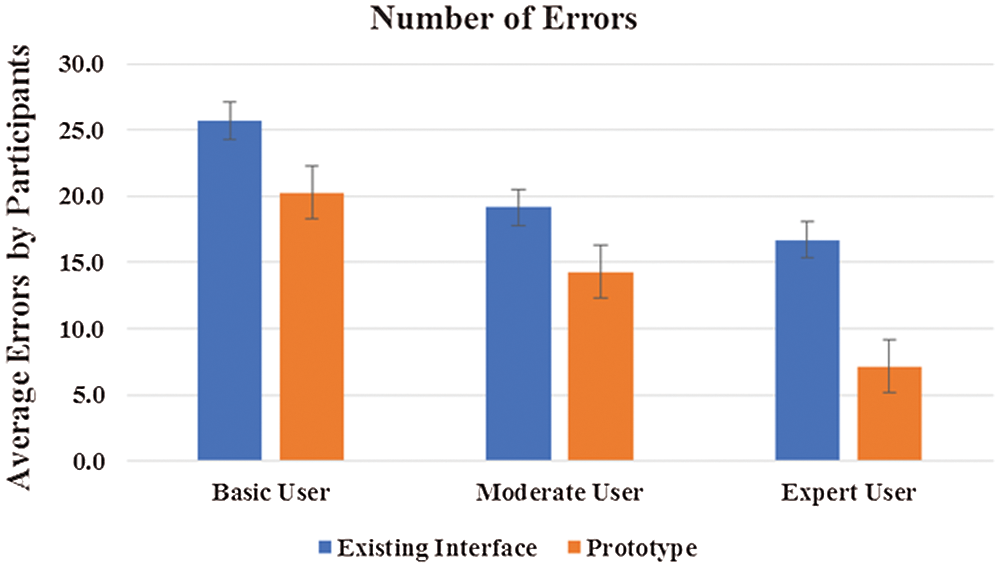
Figure 8: Number of errors in the existing interface and prototype
4.4.3 Level of Success for Task Accomplished
The level of success is an important parameter. Levels of success for task accomplished are shown in Tab. 3. Furthermore, the number of tasks not accomplished, tasks accomplished with and without error in existing interface and prototype are illustrated in Tab. 3.
Table 3: Level of success of participants

The graph bar of prototype illustrated in Fig. 9. the level of success in prototype. The graph illustrates that the tasks accomplished and tasks accomplished with errors in prototype is higher, and the number of task failure in existing interface is higher than the prototype. It proves tough the users were able to accomplish the tasks in prototype with errors but in existing interface, they ultimately failed.
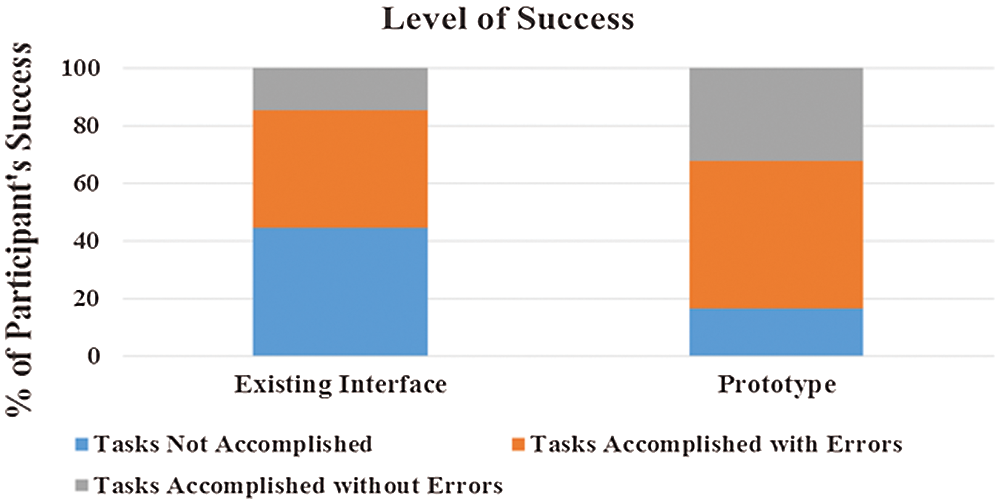
Figure 9: Level of success for both interfaces
Task Time metric concerns the amount of calculated time that it takes a participant to finish a selected test task. It is important to question whether the meantime on the prototype was improved. In Fig. 10. it is depicted the meantime variation found within basic, moderate and expert user categories of each group in existing interface and prototype. Expert users spent the least time in interaction, in contrast to basic users, who consumed the most time in interaction with the existing interface. There is a significant difference between mean time of accomplishing a task in existing interface and prototype. T-Test was conducted shows statistical significance (t(2) = 10.7 > Tcrit(two tail) = 4.3, P-value < 0.05) and reject the null hypothesis that average time consumed by all the users in existing interface and prototype is equal.
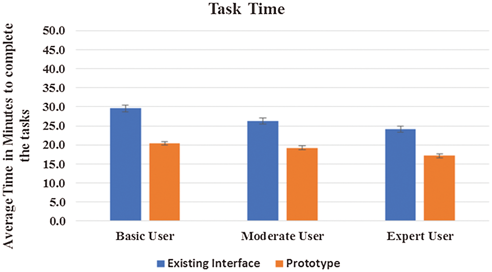
Figure 10: Average time consumed by each category of user for OAS
After performing all the tasks on the existing interface and prototype the users were given a SUS questionnaire to collect their feedback on the subjective usability of each interface respectively. The average subjective usability of the prototype is 26.7% higher than the existing interface. The SUS score for existing interface is 50.83 below average to the scale. However, for prototype is 77.6, which indicates a satisfactory response. According to Tab. 4. it is depicted that basic user average score is 47.9 and moderate user is 49.6, the score is below average, thus they showed least interest in the existing interface.

The average SUS score for prototype (M = 77.6, SD = 10.7) is significantly greater than the SUS score for the existing interface (M = 50.8, SD = 15.4). An independent samples t-test was conducted to compare a newly designed interface with the existing interface. The conditions (t(2) = 13.5 > Tcrit(one-tail) = 0.002, P-value < 0.05) illustrates a significantly greater values of prototype than the existing interface. These results shown in Fig. 11. suggests that the prototype resulted in a good SUS score by the users.
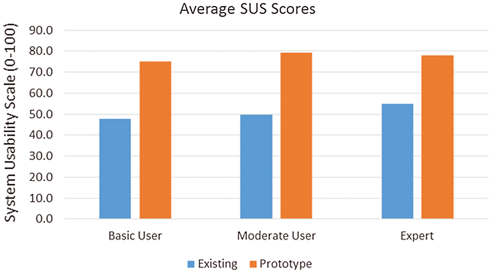
Figure 11: Average SUS Score for both interfaces
ASQ questionnaire was completed for both interfaces. It is shown in Fig. 12. the average user’s response against all three questions of ASQ. Each question represents the usability metric efficiency, effectiveness, and satisfaction in the interface. The results show that the effectiveness, efficiency, and satisfaction all have higher ratings in the prototype.
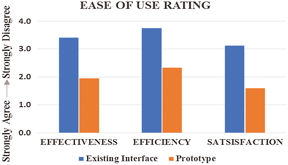
Figure 12: Rating of effectiveness, efficiency and satisfaction
Helping semiliterate users to interact with computing devices is challenging and unravels more layers of complexity as it is explored. Some recommendations that should be taken into consideration by designers during the OASs development as interpreted from the results are as follows:
5.1 Avoid Rich Multimedia Support
During the evaluation of the prototype, it was observed that the semiliterate participants focused on one item at a time in the interface. Those who cannot read utilized the audio support. As the abilities of the semiliterate participants are limited, the interface should not be too cluttered that could hamper the ability of the target user to interact with the interface. Rich multimedia are appreciated [36] but the cognitive ability of semiliterate should be taken into consideration and interface provided should be simple enough with not many modalities to avoid distraction.
5.2 Help Feature Assistance in the Video Was not Supported
Participants appreciated the help feature in an interface as exciting and exploring [37–39]. However, during the experiment, it was observed that participants were confused when they have to seek assistance using the help videos. No quantitative study was performed but it was observed during the experimentation. Therefore, the tasks should be short and simple as possible; self-explanatory excluding the need of watching videos for assistance. Participants did utilize audio support when they could not read, but watching a half minute or a minute long helping videos were not appreciated.
5.3 Combination of Native Language and Digits
The localization concept mentioned in [36,40–42] suggest the use of local language. The prototype interface was designed in the native language of users. In some studies, it was mentioned that semiliterate users can comprehend Arabic numerals [43–45]. However, to the best of our knowledge, no literature that reported on the comparison of native language numerals and digits for the semiliterate population. Participants were comfortable in comprehending task in their native language, Urdu. However, they preferred Arabic numerals than the numbers in their native language. It is suggested for future designers to use Arabic numerals, avoiding numerals in the native language.
5.4 Hand-drawn or Real-life Images
The participants were provided with hand-drawn images of doctor’s specialty and real-life images of doctors in the interface. Although hand-drawn icons were preferred according to the literature [37,46,47], findings from this study showed that semiliterate users were more excited to see real-life images. A combination of hand-drawn images and real-life images is recommended. The semiliterate population easily understands the hand-drawn images while the real-life images were exciting for them to gain attention.
5.5 Replace Typing Input with the Recording Module
It was observed that the participants found it difficult to type sentences using the keyboard. To overcome this problem, they were provided with the recording module to record their issues for the doctor’s review using the prototype rather than interacting with the hardware for typing as illustrated in Fig. 6. The target population appreciated this module. Therefore, it is recommended to devise a mechanism that semiliterate users have the least contact with hardware for text input. Although speech interfaces can be applied, more effort is needed as errors encountered during speech recognition input may produce strings of text which sound alike but different from words spoken by users. Even usage of different regional languages and dialect of users can create an issue and requires an extensive development. Overall, easy and acceptable UI design guidelines should be prepared and available for designers to implement at the front-end.
In this study, an OAS for semiliterate user prototype was proposed. This system can play a role in disseminating ICT to all and control the digital divide. During the design process, it was discovered how profoundly the various type of literacy challenges complicate a user’s ability to interact with the existing interface. Apart from having difficulties in reading the textual information from the interface, the users also faced challenges in interacting with buttons and menus, browsing a list of selections and even understanding the graphics. However, the prototype showed that the performance of semiliterate users improved significantly. The usability of the system for the semiliterate users increased from 50.83% to 77.60%. Therefore, the recommended design guidelines should be incorporated during the interface development for semiliterate users for better usability. The developed prototype is in the form of online web application and can be extended as a mobile application for Windows Phone, iPhone and Android. A portal can be established to enhance the interface according to the needs of users. Through the portal, new variants and improvements of existing icons and features can be suggested. To increase the scalability, some experiments can be performed to receive feedback from users on the icons for different specialties. A different study can be conducted for the remaining specialty icon design in the interface according to the requirements of target users. In future, a face recognition module can be added to enhance the registration process. It is good for the semiliterate users to have the least interaction with keyboard and mouse clicks to avoid high cognitive pressure. The recommended guidelines can be incorporated into interface development for semiliterate users by exploiting ICT.
Acknowledgement: Authors thankfully acknowledge all those who contributed this work in any capacity.
Funding Statement: The authors have no specific funding.
Conflicts of Interest: The authors declare no conflicts of interest to report regarding this study.
1. U. Nations. (2013). “Pakistan: UNESCO Country Programming Document 2013-2017,” UNESCO, . [Online]. Available at: https://karandaaz.com.pk/library/pakistan-unesco-country-programming-document-2013-2017/. [Google Scholar]
2. B. F. Smáradottir. (2016). “User-centred design and evaluation of health information technology,” PhD. dissertation, University of Agder, Oslo. [Google Scholar]
3. I. Medhi, A. Sagar and K. Toyama. May 25-26, 2006. , “Text-free user interfaces for illiterate and semi-literate users,” in Int. Conf. on Information and Communication Technologies and Development, ICTD’06, Berkeley, California, USA, pp. 72–82. [Google Scholar]
4. S. Jan, I. Maqsood, I. Ahmad, M. Ashraf, F. Q. Khan et al. (2020). , “A systematic feasibility analysis of user interfaces for illiterate users,” Pakistan Academy of Science, vol. 56, no. 4, pp. 75–91. [Google Scholar]
5. I. Medhi, S. Patnaik, E. Brunskill, S. N. N. Gautama, W. Thies et al. (2011). , “Designing mobile interfaces for novice and low-literacy users,” ACM Trans. on Computer Human Interaction, vol. 18, no. 1, pp. 1–28. [Google Scholar]
6. WHO. (2020). “Modes of transmission of virus causing COVID-19: Implications for IPC precaution recommendations,” Scientific Brief, . [Online]. Available at: https://www.who.int/news-room/commentaries/detail/modes-of-transmission-of-virus-causing-covid-19-implications-for-ipc-precaution-recommendations. [Google Scholar]
7. WHO. (2020). “Coronavirus disease 2019,” Situation Reports, . [Online]. Available at: https://www.who.int/emergencies/diseases/novel-coronavirus-2019. [Google Scholar]
8. CDC. (2020). “Social Distancing, Quarantine, and Isolation,” Social Distancing, https://www.cdc.gov/coronavirus/2019-ncov/prevent-getting-sick/social-distancing.html. [Google Scholar]
9. I. M. Thies. (2014). “User interface design for low-literate and novice users: Past, present and future, Foundations and Trends in Human-Computer Interaction.” Vol. 8, no. 1, pp. 1–72. [Google Scholar]
10. M. Ittefaq and A. Iqbal. (2018). “Digitization of the health sector in Pakistan: Challenges and opportunities to online health communication: A case study of MARHAM social and mobile media,” Digital Health, vol. 4, no. 1, pp. 1–13. [Google Scholar]
11. G. F. Crisis, C. G. Practices and I. Banks. (2013). “Towards effective use of ICT application in healthcare management: A descriptive study of online appointment system services of hospitals in India,” International Journal of Management Science and Technology, vol. 1, no. 7, pp. 1–26. [Google Scholar]
12. Department of Medical Informatics and Telemedicine. (2009). “Impact of Information and Communication Technologies (ICT) on Health Care, Medical University of Warsaw, . [Online]. Available at: https://pdfs.semanticscholar.org/6ba7/1a881caeb2f442e02411fb342bbc82d71ac5.pdf. [Google Scholar]
13. K. Karik. (2010). “Patient Online Services in Estonia: Fact not Fiction.” Brussels, Belgium: Estonia eHealth Foundation, . [Online]. Available at: http://docplayer.net/11972285-Patient-online-services-in-estonia.html. [Google Scholar]
14. W. Cao, Y. Wan, H. Tu, F. Shang, D. Liu et al. (2011). , “A web-based appointment system to reduce waiting for outpatients: A retrospective study,” BMC Health Services Research, vol. 11, no. 1, pp. 207. [Google Scholar]
15. MoH and Social Policy. (2010). “ICT in the National Health System-The Healthcare Online Programme. Madrid, Spain: Edificio Bronce, . [Online]. Available at: https://www.mscbs.gob.es/profesionales/hcdsns/TICS/TICS_SNS_ACTUALIZACION_EN_2010.pdf. [Google Scholar]
16. W. Yu, X. Yu, H. Hu, G. Duan, Z. Liu et al. (2013). , “Use of hospital appointment registration systems in China: a survey study,” Global Journal of Health Science, vol. 5, no. 5, pp. 193–201. [Google Scholar]
17. M. Samadbeik, M. Saremian, A. Garavand, N. Hasanvandi, S. Sanaeinasab et al. (2018). , “Assessing the online outpatient booking system,” Shiraz E-Medical Journal, vol. 19, no. 10, pp. 70. [Google Scholar]
18. M. A. Akintayo, I. O. Kikelomo, F. A. Oluwaseyi and B. O. Victoria. (2018). “A Framework for patient diagnosis system in sub-Sahara African primary health care centers,” Int. Journal of Computer and Information Technology, vol. 07, no. 02, pp. 87–90. [Google Scholar]
19. S. J. Miah, J. Hasan and J. G. Gammack. (2017). “On-cloud healthcare clinic: an e-health consultancy approach for remote communities in a developing country,” Telematics and Informatics, vol. 34, no. 1, pp. 311–322. [Google Scholar]
20. C. Bhatt, N. Dey and A. Ashour. (2017). Internet of things and big data technologies for next generation healthcare. Berlin, Germany: Springer International Publishing, p. 23. [Google Scholar]
21. W. Qidwai. (2011). “Advances in information and communication technology (ICTissues, challenges and opportunities for health care professionals,” Journal of the College of Physicians and Surgons Pakistan, vol. 21, no. 11, pp. 651–653. [Google Scholar]
22. D. H. Mehmood, D. M. Aslam, D. S. Aslam, A. Waqar, A. A. Khan et al. (2017). , “Electronic health record systems; perception and evaluation among physicians in Pakistan,” Professional Medical Journal, vol. 24, no. 01, pp. 182–187. [Google Scholar]
23. F. Sultan, M. T. Aziz, I. Khokhar, H. Qadri, M. Abbas et al. (2014). , “Development of an in-house hospital information system in a hospital in Pakistan,” International Journal of Medical Informatics, vol. 83, no. 3, pp. 180–188. [Google Scholar]
24. A. Manzoor. (2010). “Digital Punjab: Enhancing public service through technology. Punjab, Pakistan: PITB, . [Online]. Available at: https://www.pitb.gov.pk/. [Google Scholar]
25. S. Saeed, I. Jamshaid and S. Sikander. (2012). “Usability evaluation of hospital websites in Pakistan,” International Journal of Technology Diffusion, vol. 3, no. 4, pp. 29–35. [Google Scholar]
26. J. Preece, Y. Rogers and H. Sharp. (2007). Interaction Design: Beyond Human-Computer Interaction, 2nd edition, Hoboken, NJ: John Wiley & Sons. [Google Scholar]
27. C. LeRouge and N. Wickramasinghe. (2013). “A review of user-centered design for diabetes-related consumer health informatics technologies,” Journal of Diabetes Science and Technology, vol. 7, no. 4, pp. 1039–1056. [Google Scholar]
28. L. Moody. (2015). “User-centred health design: Reflections on D4D’s experiences and challenges,” Journal of Medical Engineering & Technology, vol. 39, no. 7, pp. 395–403. [Google Scholar]
29. O. Mival and D. Benyon. (2015). “User Experience (UX) Design for Medical Personnel and Patients,” in Requirements Engineering for Digital Health, S. Fricker, C. Thummler, A. Gavras, Cham: Springer, pp.117–131. [Google Scholar]
30. ISO.9241-210:2010. (2010). “Human-Centred Design for Interactive Systems, Technical Committee ISO/TC159/SC4, . [Online]. Available at: https://www.iso.org/obp/ui/#iso:std:iso:9241:-210:ed-1:v1:en. [Google Scholar]
31. HEC. (2016). “National Qualifications Framework of Pakistan. Islamabad, Pakistan: HEC Services, . [Online]. Available at: https://www.hec.gov.pk/english/services/universities/pqf/Pages/default.aspx. [Google Scholar]
32. ISO.9241-11:2018. (2018). “Ergonomics of human-system interaction. Part-11: Usability: Definitions and Concepts,” Technical Committee ISO/TC159/SC4, . [Online]. Available at: https://www.iso.org/obp/ui/#iso:std:iso:9241:-11:ed-2:v1:en. [Google Scholar]
33. J. Nielsen. (2001). “Usability Metrics. Fremont, USA: Nielsen Norman Group, . [Online]. Available at: https://www.nngroup.com/articles/usability-metrics/. [Google Scholar]
34. A. Bangor, P. Kortum and J. Miller. (2009). “Determining what individual SUS scores mean: Adding an adjective rating scale,” Journal of Usability Studies, vol. 4, no. 3, pp. 114–123. [Google Scholar]
35. J. R. Lewis. (1995). “IBM computer usability satisfaction questionnaires: Psychometric evaluation and instructions for use,” Int. Journal of Human Computer Interaction, vol. 7, no. 1, pp. 57–78. [Google Scholar]
36. I. Medhi, S. N. N. Gautama and K. Toyama. (2009). “A comparison of mobile money-transfer UIs for non-literate and semi-literate users,” in Proc. of the 27th Int. Conf. on Human Factors in Computing Systems - CHI 09, USA, pp. 1741–1750. [Google Scholar]
37. I. Medhi, A. Prasad and K. Toyama. (2007). “Optimal audio-visual representations for illiterate users of computers,” in Proc. of the 16th Int. Conf. on World Wide Web, Alberta, Canada, pp. 873–882. [Google Scholar]
38. A. Prasad and I. Medhi. (2008). “Exploring the feasibility of video mail for illiterate users,” in Proc. of the Int. Conf. on Advanced Visual Interfaces, Napoli, Italy, pp. 1–08. [Google Scholar]
39. I. Medhi and K. Toyama. (2007). “Full context videos for first time non-literate users,” in Proc. of Int. Conf. on Information and Communication Technologies and Development, Bangalore, pp. 1–9. [Google Scholar]
40. T. Devezas, J. Mashapa, B. Giesteira, D. Greunen and C. Carreira. (2014). “ICT4D HCI guidelines: A study for developing countries,” in Proc. of the 8th Int. Development Informatics Association Conf., Port Elizabeth, South Africa, pp. 189–205. [Google Scholar]
41. Z. Lalji and J. Good. (2008). “Designing new technologies for illiterate populations: A study in mobile phone interface design,” Interacting with Computers, vol. 20, no. 6, pp. 574–586. [Google Scholar]
42. F. Idrees, A. Batool and J. Qadir. (2017). “Weather forecast information dissemination design for low-literate farmers: An exploratory study,” in ACM International Conference Proceeding Series, Lahore, Pakistan, pp. 1–5. [Google Scholar]
43. I. Medhi, A. Sagar and K. Toyama. (2006). “Text-free user interfaces for illiterate and semi-literate users,” in 2006 Int. Conf. on Information and Communication Technology and Development, Berkeley, CA: ICTD, pp. 72–82. [Google Scholar]
44. T. Parikh, K. Ghosh and A. Chavan. (2003). “Design studies for a financial management system for micro-credit groups in rural India,” in Proc. of the Conf. on Universal Usability, Vancouver, British Columbia, Canada, pp. 15–22. [Google Scholar]
45. C. Nordberg. (2010). “Exploring the text free interface for illiterate users,” Master’s Thesis. The University of Bergen. [Google Scholar]
46. A. Rahman and A. Fukuda. (2015). “User interface design of e-learning system for functionally illiterate people,” Int. Journal of Advance Computer Science and Applications, vol. 6, no. 11, pp. 126–134. [Google Scholar]
47. S. Z. A. Shah, I. A. Khan, I. Maqsood, T. A. Khan and Y. Khan. (2015). “First-Aid application for illiterates and its usability evaluation,” in Proc. of 13th Int. Conf. on Frontiers of Information Technology, Islamabad, Pakistan, pp. 125–131. [Google Scholar]
 | This work is licensed under a Creative Commons Attribution 4.0 International License, which permits unrestricted use, distribution, and reproduction in any medium, provided the original work is properly cited. |