DOI:10.32604/cmc.2021.012646
| Computers, Materials & Continua DOI:10.32604/cmc.2021.012646 | |
| Article |
Using Susceptible-Exposed-Infectious-Recovered Model to Forecast Coronavirus Outbreak
1Department of Computer Science and Engineering, GIET University, Gunupur, Odisha, India
2Department of Electronics & Communication Engineering, Faculty of Engineering and Technology, SRM Institute of Science and Technology, NCR Campus, Delhi-NCR Campus, Modinagar, Ghaziabad, India
3Institute of Research and Development, Duy Tan University, Da Nang, 550000, Viet Nam
4University of Transport Technology, Hanoi, 100000, Viet Nam
5Department of ECE, KIET Group of Institutions, Ghaziabad, India
6Centre for Advanced Modelling and Geospatial Information Systems (CAMGIS), University of Technology Sydney, Sydney, NSW, 2007, Australia
7Department of Energy and Mineral Resources Engineering, Sejong University, Seoul, 05006, Korea
8Center of Excellence for Climate Change Research, King Abdulaziz University, Jeddah, 21589, Saudi Arabia
9Earth Observation Center, Institute of Climate Change, Universiti Kebangsaan Malaysia, 43600, Selangor, Malaysia
*Corresponding Author: Hiep Van Le. Email: levanhiep2@duytan.edu.vn
Received: 07 July 2020; Accepted: 27 October 2020
Abstract: The Coronavirus disease 2019 (COVID-19) outbreak was first discovered in Wuhan, China, and it has since spread to more than 200 countries. The World Health Organization proclaimed COVID-19 a public health emergency of international concern on January 30, 2020. Normally, a quickly spreading infection that could jeopardize the well-being of countless individuals requires prompt action to forestall the malady in a timely manner. COVID-19 is a major threat worldwide due to its ability to rapidly spread. No vaccines are yet available for COVID-19. The objective of this paper is to examine the worldwide COVID-19 pandemic, specifically studying Hubei Province, China; Taiwan; South Korea; Japan; and Italy, in terms of exposed, infected, recovered/deceased, original confirmed cases, and predict confirmed cases in specific countries by using the susceptible-exposed-infectious-recovered model to predict the future outbreak of COVID-19. We applied four differential equations to calculate the number of confirmed cases in each country, plotted them on a graph, and then applied polynomial regression with the logic of multiple linear regression to predict the further spread of the pandemic. We also compared the calculated and predicted cases of confirmed population and plotted them in the graph, where we could see that the lines of calculated and predicted cases do intersect with each other to give the perfect true results for the future spread of the virus. This study considered the cases from 22 January 2020 to 25 April 2020.
Keywords: COVID-19; SEIR; forecasting; global pandemic; predict confirmed case
On December 31, 2019, the city of Wuhan, China, announced an episode of typical pneumonia brought about by the 2019 novel coronavirus (2019-nCoV). Cases soon appeared in other Chinese urban areas, and steps were taken to avoid triggering a worldwide epidemic [1]. Two other novel coronaviruses (CoVs) have previously developed as major worldwide dangers in this century: Severe acute respiratory syndrome coronavirus (SARS-CoV), in 2002, which spread to 37 countries; and Middle East respiratory syndrome coronavirus (MERS-CoV), in 2012, which spread to 27 countries. SARS-CoV caused more than 8,000 cases and 800 deaths, while MERS-CoV infected 2494 people and caused 858 deaths worldwide [2–4]. COVID-19 immediately spread to 24 countries on four continents in less than two months (as of February 10, 2020) [5–7]. To avoid comparable episodes of COVID-19 in different locales outside Wuhan city, Wuhan declared that its urban transport, tram, ship, and any travel of significant distance were suspended, and the air terminals and trains from Wuhan were likewise briefly shut down on January 23, 2020, specifically the “city closure.” On January 30, 2020, the World Health Organization (WHO) proclaimed the quickly spreading COVID-19 a public health emergency of international concern (PHEIC) [8]. However, because of the rapid worldwide spread of the scourge, WHO has expanded the evaluation of the danger of spread and effect of COVID-19 at the worldwide level [9]. Although several alternatives are perceived to treat or forestall COVID-19, including immunizations, monoclonal antibodies, oligonucleotide-based treatments, and different medications, immunizations and antiviral medications normally require a long time to develop the antibodies [10–25]. Given the criticality of the situation, there is a need to evaluate the pandemic’s spread so that specific measures can be taken to confine it. The infection can be diagnosed by a test that employs polymerase chain reaction (PCR) and identifies the virus based on its genetic fingerprint. Currently, the only treatment for the virus is supportive care; there is currently no vaccine to protect against the virus and few vaccines around the world are in the development stage. This paper will discuss the most recent pandemic circumstances of COVID-19 around the globe, in particular the Chinese province of Hubei, and the countries of Taiwan, South Korea, Japan, and Italy. This study is focused on the cumulative daily figures from around the world with three main variables of interest: Confirmed cases, deaths, and recoveries.
One of the fundamental ideas of the mathematical study of epidemiology is to model the outbreak of an infectious disease on a given population. The susceptible-exposed-infected-recovered (SEIR) model is used to model the outbreak of a pandemic. Fig. 1 illustrates a typical SEIR schema scenario in which members of the susceptible population Su(t) become part of the exposed population Ex(t) at the rate proportional to b1. The exposed, in turn, are transitioned to the infected populace In(t) at the rate proportional to b2. The infected recover at a rate proportional to b3 and those who recover Re(t) from the disease return to the population with a susceptibility rate proportional to b4.
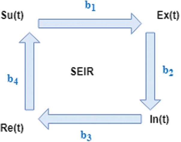
Figure 1: SEIR Model
The SEIR model explains the rate at which COVID-19 is affecting people worldwide. This model uses the dataset of the victims, along with the dates when they are suspected of being or are declared as the victims of COVID-19, and plots them in the graphs by country to predict the rate of a future outbreak. The model also predicts the ratio (infected population every 20 days) of the growth of the danger and how long it is going to last. The denotations are Su-susceptible (number of susceptible populations); Ex-Expose (number of exposed populations); In-Infectious (number of infected populations); and Re-Recovered or Removed (number of recovered or immune individuals). We have  ; this is constant due to the equal values of birth and death rates, where N is the population of the country. Using the
  model, the differential function is as below:


where


This study uses several differential equations to find the S, E, I, R, but two questions remain: What is “Ret,” “Tinf,” and “Tinc,” and how can we define these variables? Re0 and Ret represent the r, which describes the individuals who are no longer infected or immunized (naturally or through vaccination). Tinf represents the average duration of the infection, and 1/Tinf can be treated as the D units of time for one individual to recover. Tinf represents the average incubation period, assuming that some intervention will cause the reproduction number (Re0) todecrease (such as bed nets, vaccines, government actions, isolation, and quarantine), but that their effectiveness will decline over time.
The method we have used for our analysis is based on the COVID-19 dataset collected from relevant sources (https://github.com/ieee8023/covid-chestxray-dataset). The dataset contains the day-by-day confirmed cases worldwide from January 22, 2020 to April 25, 2020, as shown in Tab. 1. The dataset consists of a total of 30,049 columns and 6 rows, and it includes 5 attributes.
Table 1: Data set of the COVID-19 world-wide
We compared Intervention and non-intervention conditions on the SEIR model. At first, the dataset and the population of each country were input into the model. The SEIR model was plotted using the dataset and started for training. Fig. 2 showed that without intervention, the number of cases in Hubei will keep increasing. Initially, the dataset of Hubei was input into the model, and then, starting with the first confirmed case in the dataset, each confirmed case was initialized for getting trained. Then, using the total length of the training dataset, the number of days that would be used for making a prediction was calculated. Then, for each calculation for the SEIR model, the following initializations were introduced:
# Initial state for SEIR model;
s = (N − n_infected)/N;
e = 0; i = n_infected/N;
r = 0;
# Define all variable of SEIR model;
 # average incubation period;
 # average infectious period;
R0 = 3.954# reproduction number.
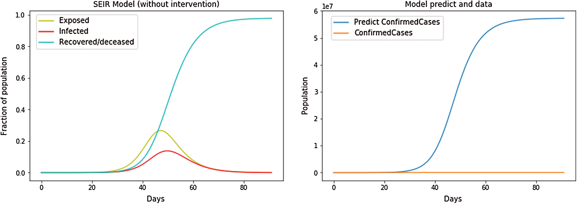
Figure 2: SEIR Model without intervention
After all of the variables, including average incubation period and average infectious period, were defined, the intervention parameters were defined. Using NumPy, we plotted the model that predicts the confirmed cases together with the confirmed cases in the dataset for comparison. Here, we used logistic regression along with polynomial regression with the logic multiple linear regression and linear regression.
We fit the SEIR model to real data, then found the best variables of the SEIR model to fit the real data.
• Tinf was using the average value 2.9;
• Tinc was using the average value 5.2;
•  found the best reproduction number by fitting the real data (if using a decay function, we found the parameter of decay function);
•  found the best-case fatality rate (this parameter is to predict fatalities);
Intervention for the SEIR model is shown in Fig. 3.
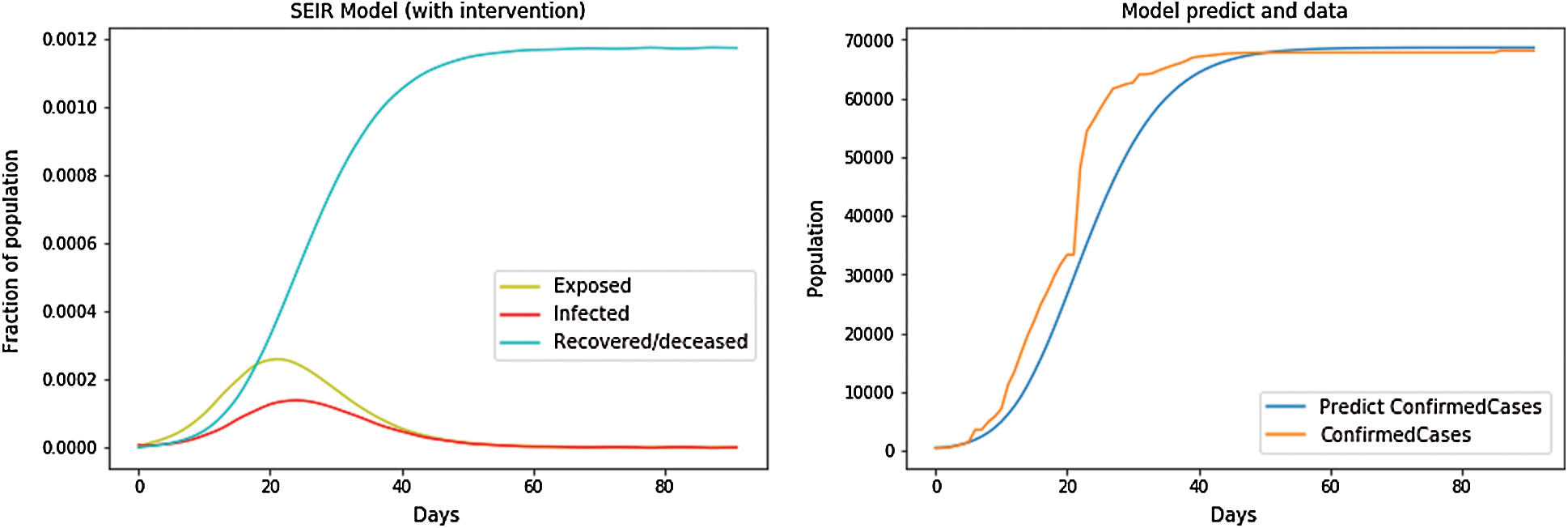
Figure 3: SEIR Model with intervention
After a few days, the intervention started,  , At first, we took a constant reproduction number, i.e., a constant value of parameters Re0 and cfr, the population of each country (N) and n_infected, i.e., the number of confirmed cases (starting from first confirmed case in dataset), the maximum number of days of prediction and the initial state of the SEIR model. Then, we let the number of intervention days be 80. When the period exceeded 80 days, we set the Re0 value to half by applying the formula
  . Then,we used the differential equations given above to find the suspected, exposed, infected, and recovered cases from the dataset and imposed them on the dependent variable (confirmed cases) using the independent variables to further predict the number of confirmed cases and the function of fitting the SEIR model to real data:
• We auto-choose the best decay function of Ret (intervention days decay or Hill decay is represented in Fig. 4);
• If the total case/country population is below 1, we reduced the country population;
• If the dataset was still no case, then it returned 0;
• We plotted the fit result and forecast trends
The hidden function will be discussed in mathematical code.
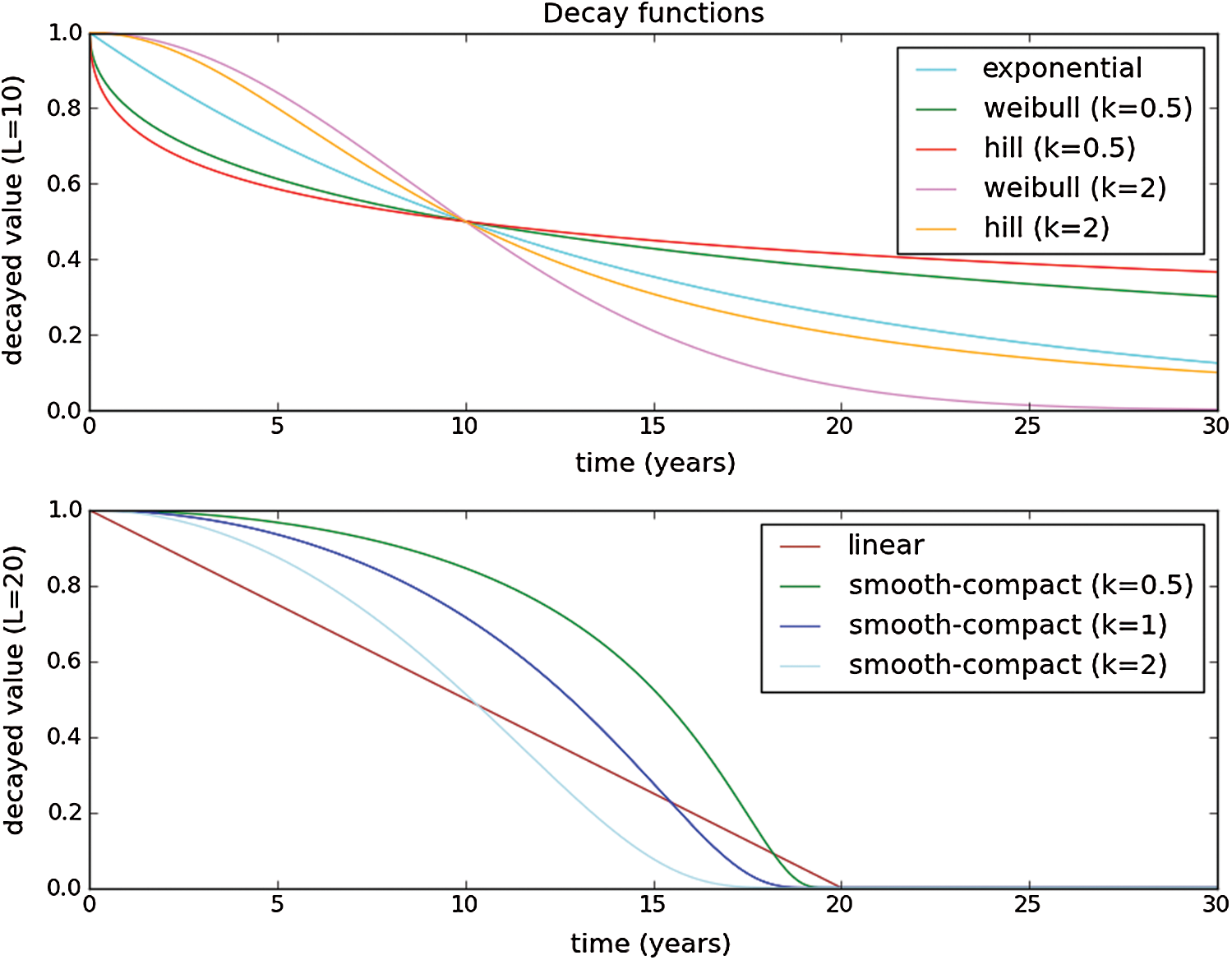
Figure 4: Decay Function
3.2 COVID-19 Forecasts in Taiwan
We first checked to see if the country’s name was listed in the training dataset. If the country’s name was not listed in the dataset, then we trained it and set the country’s name in the province state. If the country’s name was listed in the dataset, then we trained it and set the country’s name in the country region. Then after using a random variable (such as a, b), we fit the model and plotted the fit results into the graph, i.e., where ‘a’ is the independent variable and ‘b’ is the dependent variable, with values of dates and population, respectively. As shown in Fig. 5, the depicted data have been taken from the dataset where we have performed the calculations to find the SEIR model and then simply plotted them. In Fig. 5, we can see that the infected population rate, depicted by the red line, is fluctuating, but is constant at the population range of 0.0000 with the number of days increasing from 60 to 100. It is the same as that of the exposed population, which is depicted by the yellow line, where the yellow line is fluctuating, but it is constant at the population range of 0.0000 with the increase in days. However, if we look at the recovered cases, which are depicted by the blue line, the blue line is fluctuating, but it is increasing as the number of days increases.
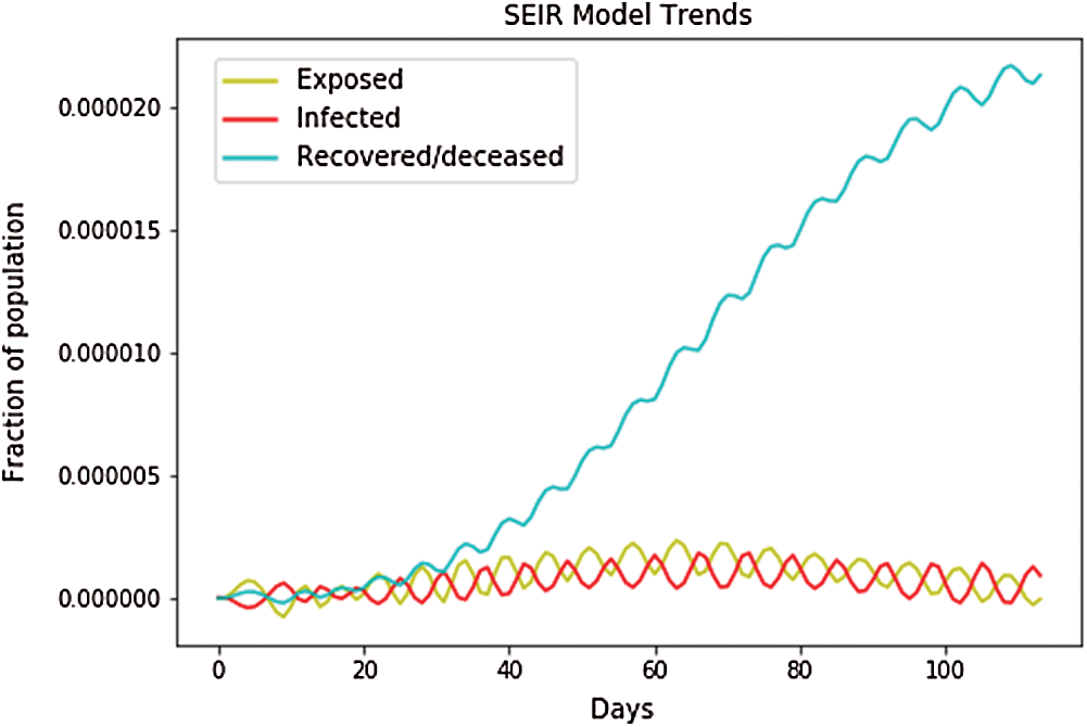
Figure 5: SEIR model trends for Taiwan
Fig. 6 shows the independent variables of both the predicted and depicted cases. The depicted cases are represented by valid cases and the predicted cases are represented by the trained cases. We have also plotted the cumulative case study hereafter calculation and perfect prediction of training. The red line depicts the cumulative study of the modeled infected population, which is observed to increase from day 15 with a nearly constant increase of infected cases from 30 to 400. The green line represents the trained confirmed cases, which remain nearly constant from day 3 to day 15 at the population hold of 0.000, but then it sharply increases to a population count of nearly 400 within a smaller period. The yellow line represents the valid infected populations, which are calculated using the above differential equations, and we obtained a perfect result because the prediction line touches the yellow line, which means our predictions are correct. If we start plotting, the red line will automatically intersect with the yellow line, and our future predictions will also be correct. The blue line represents the valid confirmed cases that we have calculated using the above differential equations, and the result is that the red line. which represents the predicted confirmed cases, touches the blue line, which signifies that our prediction is correct.
Figure 6: Real confirmed case and predict confirmed case for Taiwan
Fig. 7 shows the overall case study. The x-axis represents the dates of confirmation and the y-axis represents the population of the confirmed cases on that date. The green line, which depicts the confirmed case population that we have calculated through April 22, 2020, shows that the number of confirmed cases was zero on January 25, 2020, butit had risen to 425 by April 21, 2020. The red line, which depicts the predicted or trained case of confirmed cases, shows that on January 22, 2020, there were no confirmed cases but by June 22, 2020, the number had risen to 524. After that date, the number will stabilize with no additional confirmed cases with an increase in time. Because we can observe that the real and the predicted lines provide nearly the same results, we can conclude that our predictions are correct.
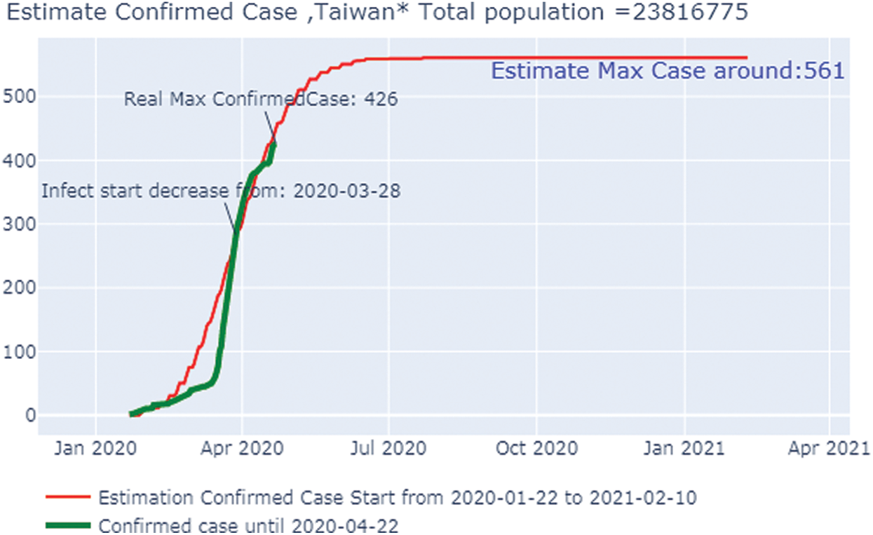
Figure 7: Estimated confirmed case Taiwan
3.3 COVID-19 Forecasts in South Korea
Fig. 8 shows that the infected population rate depicted by the red line is almost constant at the population range of 0.0000 with the increase in days (from 60 days to 100 days). The infected population rate is the same as that of the exposed population, depicted by the yellow line, which slightly increases from 40 to 60 days up to a fractional increase of population, to 0.0004, but then remains constant at the population range of 0.0000 with the increase of days. However, the blue line, which represents the number of recovered cases, increases with the increasing number of days. In Fig. 9, we have plotted the independent variables of both predicted and depicted cases. The depicted cases are represented by valid cases and the predicted cases are represented by the trained cases. We have also plotted the cumulative case study here. After calculation and perfect prediction of training, we can observe that the red line, which depicts the cumulative study of the modeled infected population, increases from day 20 with a nearly constant increase of population from 1000 to 11,000. The green line represents the number of trained confirmed cases, which remain nearly constant up to day 17 when the population holds at 0.000, but then it increases sharply to a population count of nearly 7000 within a short time period. Once it reaches 7000, it increases at a uniform rate. The yellow line represents the valid infected populations that are calculated using the above differential equations. We obtained a perfect result, since out prediction line touches the yellow line, which means our predictions are correct, and if we start plotting more, the red line will automatically intersect with the yellow line, and our future predictions will also be correct. We observe the same with the blue line, which represents the valid confirmed cases that we have calculated using the above differential equations. The results show that the red line, which represents the predicted confirmed cases, touches the blue line, which signifies that our prediction is correct.
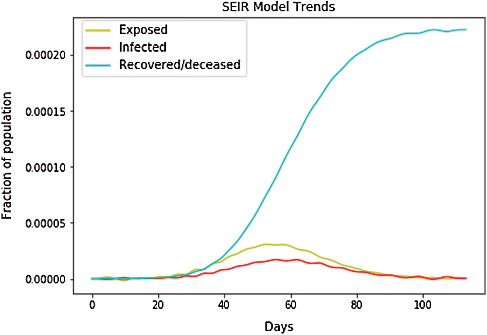
Figure 8: SEIR model trends for South Korea
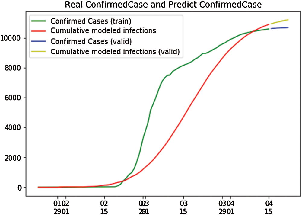
Figure 9: Real confirmed case and predict confirmed case for South Korea
Fig. 10 shows the overall case study. The x-axis represents the dates of confirmation and the y-axis represents the population of the confirmed cases on that date. The green line, which depicts the confirmed case population calculated through April 22, 2020, shows that the number of confirmed cases was zero on January 25, 2020, but it rose to 10,694 by April 22 2020. The red line, which depicts the predicted or trained case of confirmed cases, shows that on January 22, 2020, there were no confirmed cases, but by June 8, 2020, there were 11,451 cases. After that date, the number will stabilize with no addition of confirmed cases with an increase in time. Because we can observe that the real and the predicted lines give nearly the same results, we can conclude that our predictions are not wrong.
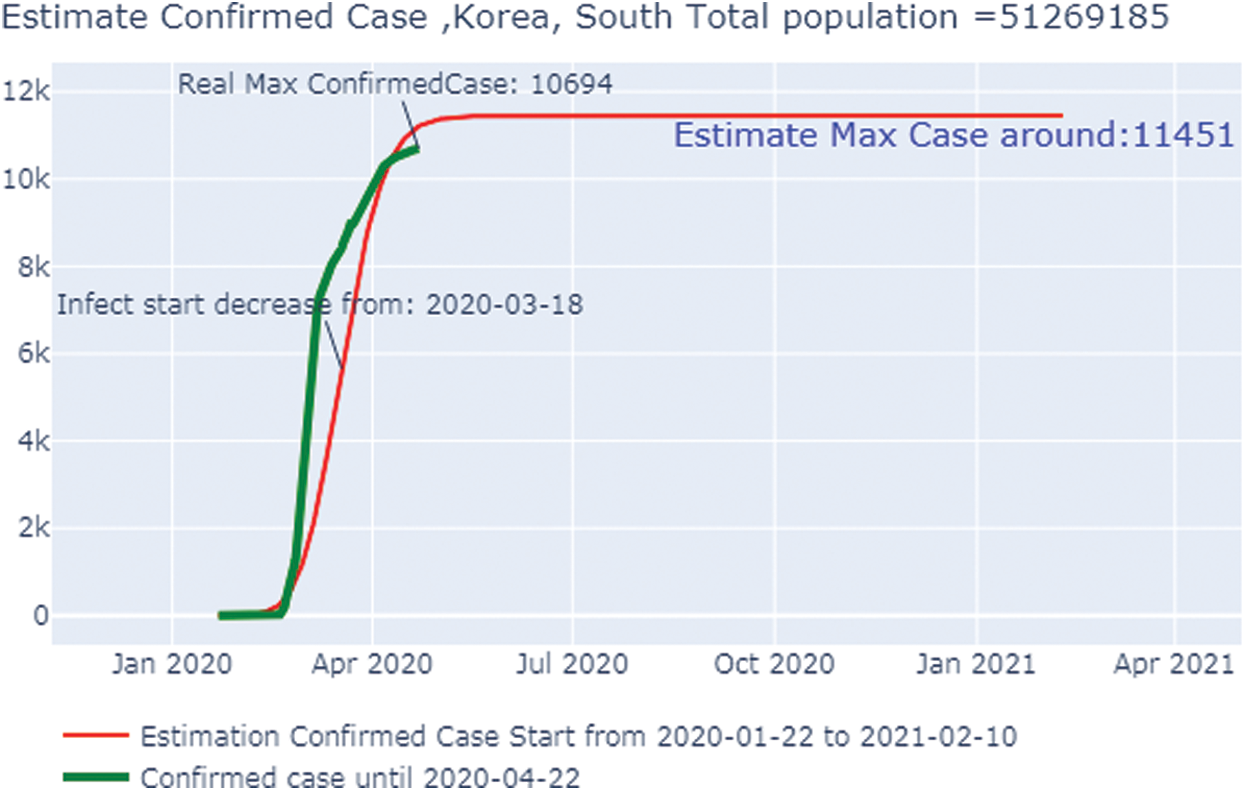
Figure 10: Estimated confirmed case in South Korea
3.4 COVID-19 Forecasts in Japan
In Fig. 11, the depicted data have been taken from the dataset,and calculations have been performed to find the SEIR model and simply plot it. In Fig. 11, the infected population rate depicted by the red line is almost constant at the population range of 0.0000 with the increase in days. It is the same as that of the exposed population, which is depicted by the yellow line. The yellow line slightly increases from day 40 to 60 up to a fraction of population increase up to 0.0004, but then it remains constant at the population range of 0.0000 with the increase in days. However, when we look at the recovered cases depicted by the blue line, the blue line is increasing with the increase in days. Fig. 12 shows the independent variables of both predicted and depicted cases. The depicted cases are represented by valid cases,and the predicted cases are represented by the trained cases. We have also plotted the cumulative case study here. After calculation and perfect prediction of training, we observe that the red line, which depicts the cumulative study of modeled infected population, increases from day 20 with a nearly constant increase of population from 1000 to 11,000. The green line represents the trained confirmed cases, which remain nearly constant up to day 17 at the population hold of 0.000, but then it increases steeply to a population count of nearly 7000 within a short time period. Once it reaches 7000, it increases at a uniform rate. The yellow line represents the valid infected populations, which are calculated using the above differential equations. We obtain a perfect result, since our prediction line touches the yellow line, which means our predictions are absolutely correct. Additionally, if we start plotting further, the red line will automatically coincide with the yellow line, meaning that our future predictions will also be correct. It is the same with that of the blue line, which represents the valid confirmed cases that we have calculated using the above differential equations. We obtain the result that the red line, which represents the predicted confirmed cases, touches the blue line, which signifies that our prediction is correct.
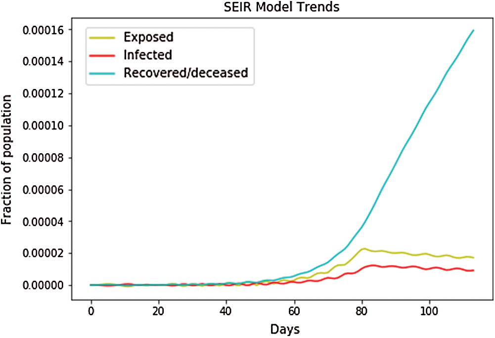
Figure 11: SEIR model trends for Japan
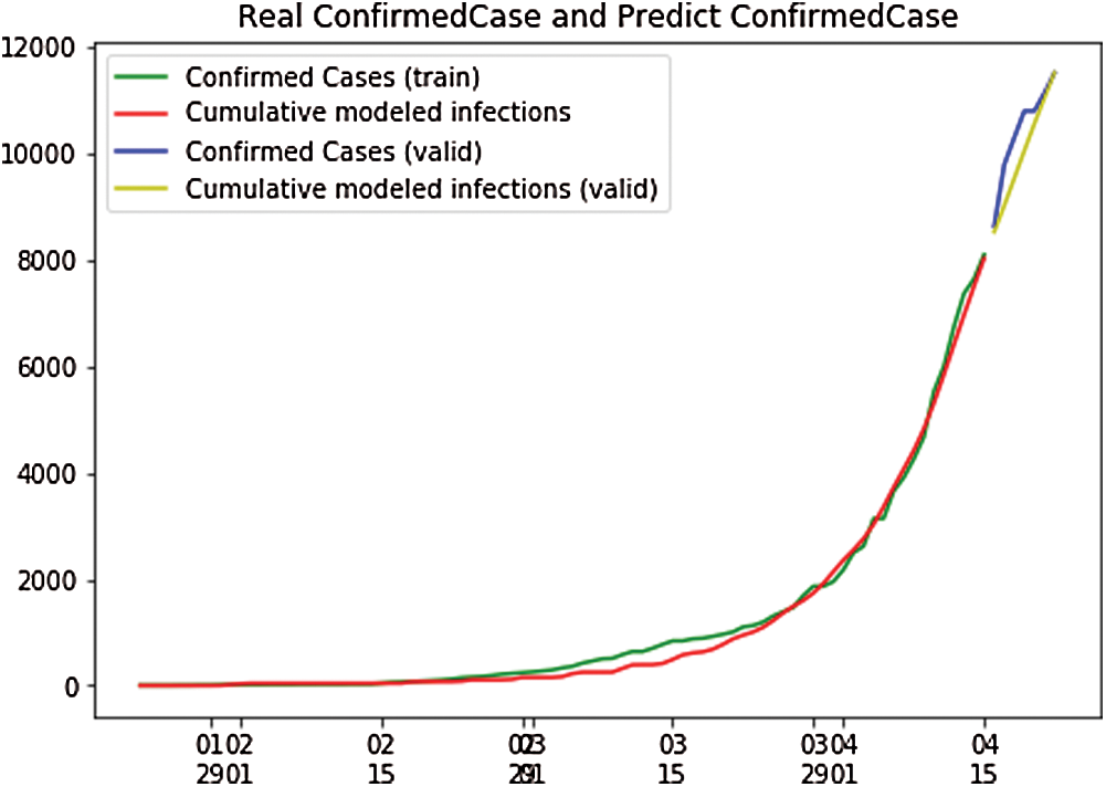
Figure 12: Real confirmed case and predict. Confirmed case for Japan
Fig. 13 shows the overall case study. The x-axis represents the dates of confirmation and the y-axis represents the population of the confirmed cases on that date. The green line,which depicts the confirmed case population,has been calculated through April 22, 2020 to show that the number of confirmed cases was zero on February 2, 2020, but it had risen to 187,327 by April 21, 2020. The red line,which depicts the predicted or trained case of confirmed cases, shows that on January 22, 2020, there were no confirmed cases, but by September 27, 2020, the number had risen to 27.14 million. After that date, the number will stabilize with no additional confirmed cases with an increase in time. Because we can observe that the real and the predicted lines give nearly, the same results, we can conclude that our predictions are not wrong.
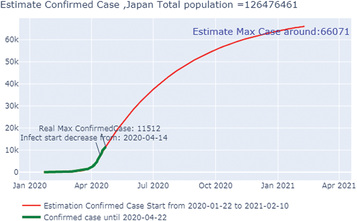
Figure 13: Estimated confirmed cases in Japan
3.5 COVID-19 Forecasts in Italy
In Fig. 14, the depicted data have been taken from the dataset, and we have performed the calculations to find the SEIR model and plotted the data. Fig. 14 shows that the infected population rate, depicted by the red line, is almost constant at the population range of 0.0000 with the increase in days, but it increases at a fraction of 0.01 between 60 and 100 days. Similarly, the exposed population, which is depicted by the yellow line, slightly increases with a fraction of a population of 0.1 to 0.2 from day 80 to day 100. However, the blue line, which depicts the case of the recovered population, is increasing sharply with the increase in days. In Fig. 15, we observe the independent variables of both predicted and depicted cases. The described cases are represented by valid cases, and the trained cases are represented by the predicted cases. We have also plotted the cumulative case study here. After calculation and perfect prediction of training, we can see that the red line, which depicts the cumulative study of the modeled infected population, increases sharply up to 300,000 of the population. The green line represents the number of trained confirmed cases, which remain nearly constant up to day 13 when the population holds at 0.000, but then they increase to a population count of nearly 200,000 within one month. The yellow line represents the valid infected population, which is calculated using the above differential equations. We obtain a perfect result since our prediction line touches the yellow line, which means our predictions are correct. If we plot further, the red line will automatically coincide with the yellow line, indicating that our future predictions will also be correct. Similarly, the blue line represents the valid confirmed cases that we have calculated using the above differential equations. We obtain the result that the red line, which represents the predicted number of confirmed cases, touches the blue line, which signifies that our prediction is correct.
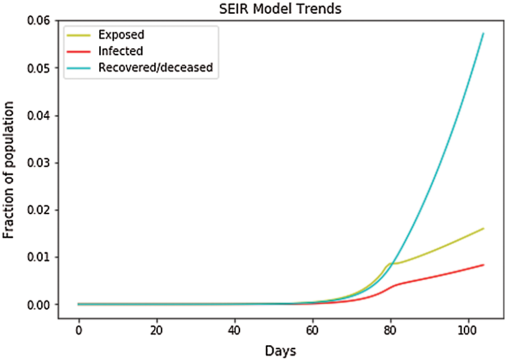
Figure 14: SEIR model trends for Italy
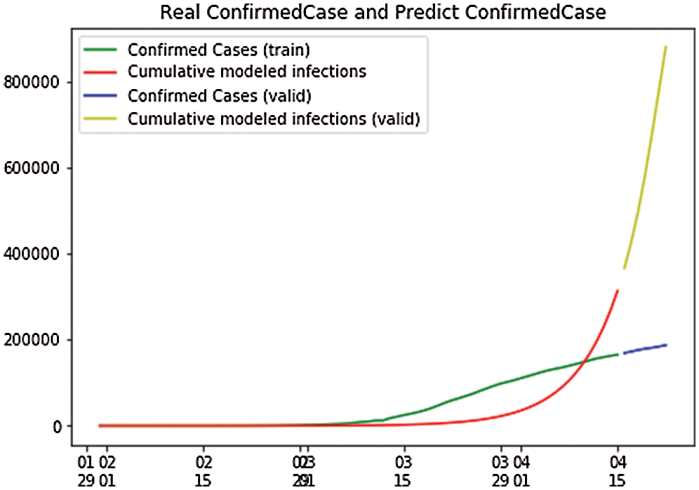
Figure 15: Real confirmed case and predict. Confirmed case for Italy
Fig. 16 shows the overall case study. The x-axis represents the dates of confirmation and the y-axis represents the population of the confirmed cases on that date. The green line,which depicts the confirmed case population, which we have calculated through April 22, 2020, shows that there were two confirmed cases as of February 2, 2020, but by April 22, 2020, that number had risen to 187,327. The red line, which depicts the predicted or trained case of confirmed cases, shows that there were no confirmed cases on January 22, 2020, but by November 17, 2020, that number was expected to rise to 27.54 million. After that, it went to a stable state with no additional confirmed cases with an increase in time. Here we can observe that the real and the predicted lines provide nearly the same results; hence we can conclude that our predictions about the cases of COVID-19 matched the calculated cases.
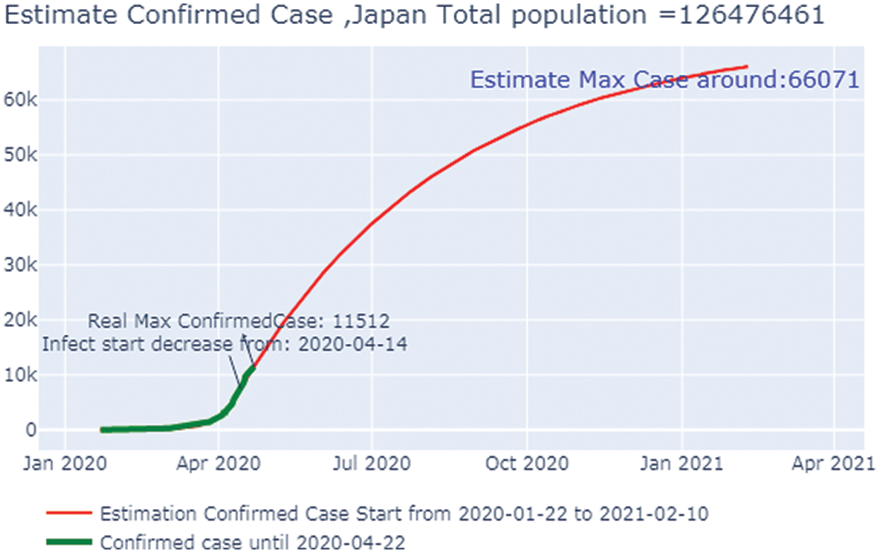
Figure 16: Estimated confirmed case in Italy
3.6 COVID-19 Global Forecasting
In the global forecast, we have used group by function to plot all the cases worldwide in a cumulative manner. In Fig. 17, the depicted data have been taken from the dataset where we have done the calculations to find the SEIR model and plotted it. Fig. 17 shows that the infected population rate depicted by the red line is almost at the population range of 0.0000 with the increase of days, but from day 60, the infected population rate has increased to the population fraction of 0.0003. Similarly, the exposed population, which is depicted by the yellow line, increases from day 60 with a fraction of population increase up to 0.0002. However, the blue line, which represents the recovered population, is increasing with the increase in days up to a fraction of the population of 0.0009. Fig. 18 shows the independent variables of both predicted and depicted cases. The depicted cases are represented by valid cases and the predicted cases are represented by the trained cases. We have also plotted the cumulative case study here. After calculation and a perfect prediction of training, we observe that the red line, which depicts the cumulative study of the modeled infected population, increases from 20 days with an increase of population from 500,000 to 2 million. The green line represents the number of trained confirmed cases, which remain nearly constant up to day 17 at the population hold of 0.000, but then it increases to a population count of nearly 2 million within a short period (from 60 days to 100 days). The yellow line represents the number of infected people that are calculated using the above differential equations. We obtained a perfect result since our prediction line touches the yellow line, which means our predictions are correct. If we plot further, the red line will automatically coincide with the yellow line and our future predictions will also be correct. It is the same with that of the blue line, which represents the valid confirmed cases that we have calculated using the above differential equations. The results show that the red line, which represents the predicted confirmed cases, touches the blue line, which signifies that our prediction is correct.
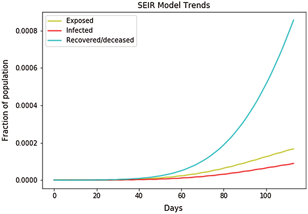
Figure 17: SEIR model trends in the global
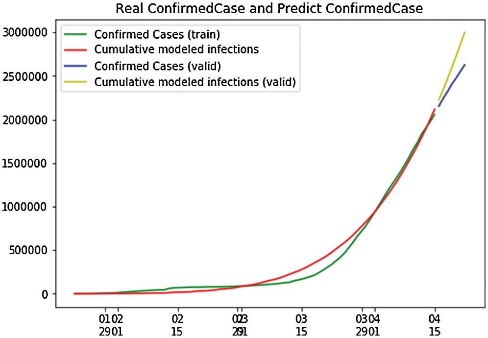
Figure 18: Real confirmed case and predict, confirmed case in the global
Fig. 19 shows the overall case study. The x-axis represents the dates of confirmation and the y-axis represents the population of the confirmed cases on that date. The green line, which depicts the confirmed case population calculated through April 22, 2020,shows that there were 653 confirmed cases on January 23, 2020, but by April 27, 2020 that number had risen to 2.6 million. The red line depicts the predicted or trained case of confirmed cases, and it shows that there were nine confirmed cases on January 25, 2020, but that the number is forecast to rise to 36.63 million by October 9, 2020. After that, it will go to a stable state with no additional confirmed cases with an increase in time. Here, we can observe that the real and the predicted lines give nearly the same results, enabling us to conclude that our predictions match that of the calculated cases.
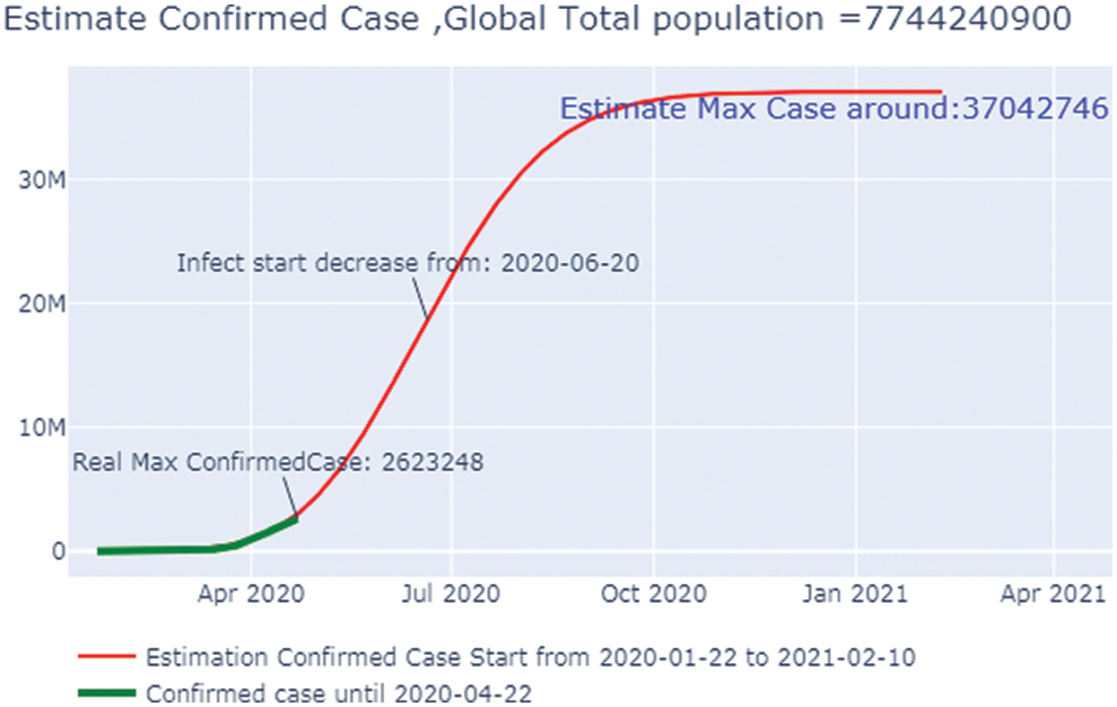
Figure 19: Estimated confirmed case in the Global
The effectiveness of prediction depends upon the authenticity of the data and the data sources. A comparative analysis of COVID-19 is shown in Tab. 2. We focused our SEIR research model on the countries of Taiwan, Korea, Japan. and Italy, as well as Hubei Province, China. Our global forecasting was conducted by using the population as a parameter to predict the number of cases of people exposed to, infected by, and recovered from COVID-19. We also compared the actual number and predicted number of confirmed cases for all countries, as well as the estimated number of confirmed cases globally.
In this paper, the dataset of some countries was used to study the cases of COVID-19. We used the SEIR model to predict the future outbreak of COVID-19. We applied four differential equations to calculate the number of confirmed cases in each country, plotted them on a graph, and then applied polynomial regression with the logic of multiple linear regressions to predict the further spread of the pandemic. We also compared the calculated and predicted cases of confirmed population and plotted them in the graph, where we could see that the lines of calculated and predicted cases do intersect with each other to give the perfect true results for the future spread of the virus. This study considered the cases from January 22, 2020 to April 25, 2020. The objective of this work is to help China in its fight against the pandemic. In the future, machine learning and deep learning algorithms with artificial intelligence will be used for training and testing the model, which will enable us to predict trends even more accurately.
Funding Statement: This research was funded by the Centre for Advanced Modelling and Geospatial Information Systems (CAMGIS), Faculty of Engineering and IT, University of Technology Sydney.
Conflicts of Interest: The authors declare that they have no conflicts of interest to report regarding the present study.
1. J. T. Wu, K. Leung and G. M. Leung. (2020). “Now casting and forecasting the potential domestic and international spread of the 2019-nCoV outbreak originating in Wuhan, China: A modeling study,” Lancet, vol. 395, no. 10225, pp. 689–697. [Google Scholar]
2. Q. Li, X. Guan, P. Wu, X. Wang, L. Zhou et al. (2020). , “Early transmission dynamics in Wuhan, China, of novel corona virus—infected pneumonia,” New England Journal of Medicine, vol. 382, no. 13, pp. 1199–2007. [Google Scholar]
3. V. J. Munster, M. Koopmans, N. Doremalen, D. Riel and E. Wit. (2020). “A novel corona virus emerging in China—key questions for impact assessment,” New England Journal of Medicine, vol. 382, no. 8, pp. 692–694. [Google Scholar]
4. N. Zhu, D. Zhang, W. Wang, X. Li, B. Yang et al. (2020). , “A novel corona virus from patients with pneumonia in China, 2019,” New England Journal of Medicine, vol. 382, pp. 727–733. [Google Scholar]
5. C. Rothe, M. Schunk, P. Sothmann, G. Bretzel, G. Froeschl et al. (2020). , “Transmission of 2019-nCoV infection from an asymptomatic contact in Germany,” New England Journal of Medicine, vol. 382, no. 10, pp. 970–971. [Google Scholar]
6. M. L. Holshue, C. Bolt, S. Lindquist, K. H. Lofy, J. Wiesman et al. (2020). , “First case of 2019 novel corona virus in the United States,” New England Journal of Medicine, vol. 382, no. 10, pp. 929–936. [Google Scholar]
7. WHO. (2020). “Novel corona virus (2019-nCoV) situation report—21,” . [Online]. Available: https://www.who.int/docs/defaultsource/coronaviruse/situationreports/20200210-sitrep-21-ncov.pdf?sfvrsn=947679ef_2. [Google Scholar]
8. F. S. Wang and C. Zhang. (2020). “What to do next to control the 2019-nCoV epidemic,” Lancet, vol. 395, no. 10222, pp. 391–393. [Google Scholar]
9. WHO. (2020). “Novel corona virus (2019-nCoV) situation report—39,” . [Online]. Available: https://www.who.int/docs/defaultsource/coronaviruse/situationreports/20200228-sitrep-39-covid-19.pdf?sf-vrsn=5bbf3e7d_2. [Google Scholar]
10. M. Wang, R. Cao, L. Zhang, X. Yang, J. Liu et al. (2020). , “Remdesivir and chloroquine effectively inhibit the recently emerged novel Corona Virus (2019-nCoV) in Vitro,” Cell Research, vol. 30, no. 3, pp. 269–271. [Google Scholar]
11. H. Lu. (2020). “Drug treatment options for the 2019-new corona virus (2019-nCoV),” Bioscience Trends, vol. 14, no. 1, pp. 69–71. [Google Scholar]
12. J. Zhang, L. Zhou, Y. Yang, W. Peng, W. Wang et al. (2020). , “Therapeutic and triage strategies for 2019 novel corona virus disease in fever clinics,” Lancet Respiratory Medicine, vol. 8, no. 3, pp. e11–e12. [Google Scholar]
13. P. Richardson, I. Griffin, C. Tucker, D. Smith, O. Oechsle et al. (2020). , “Baricitinibas potential treatment for 2019-nCoV acute respiratory disease,” Lancet, vol. 395, no. 10223, pp. e30–e31. [Google Scholar]
14. L. Guangdi and D. C. Erik. (2020). “Therapeutic options for the 2019 novel Corona Virus (2019-nCoV),” Nature Reviews Drug Discovery, vol. 19, no. 3, pp. 149–150. [Google Scholar]
15. F. Petropoulos and S. Makridakis. (2020). “Forecasting the novel corona virus COVID-19,” PLoS One, vol. 15, no. 3, e0231236. [Google Scholar]
16. Y. Huang, L. Yang, H. Dai, F. Tian and K. Chen. (2020). “Epidemic situation and forecasting of COVID 19 in and outside China,” Bull World Health Organ E-pub, vol. 5, pp. 1–23. [Google Scholar]
17. J. Luo. (2020). “When will COVID-19 end? data-driven prediction,” Data-Driven Innovation Lab, vol. 6, pp. 1–9. [Google Scholar]
18. J. Shaman and A. Karspeck. (2020). “Forecasting seasonal outbreaks of Influenza,” Proceedings of the National Academy of Sciences of the United States of America, vol. 109, no. 50, pp. 20425–20430. [Google Scholar]
19. S. Shaman, J. Yang and W. Kandula. (2014). “Inference and forecast of the current west African Ebola outbreak in Guinea, Sierra Leone and Liberia,” PLoS Currents, vol. 6, pp. 1–12. [Google Scholar]
20. E. Massad, M. N. Burattini, L. F. Lopez and F. A. Coutinho. (2005). “Forecasting versus projection models in epidemiology: The case of the SARS epidemics,” Medical Hypotheses, vol. 65, no. 1, pp. 17–22. [Google Scholar]
21. M. Ture and I. Kurt. (2006). “Comparison of four different time series methods to forecast hepatitis a virus infection,” Expert Systems with Applications, vol. 31, no. 1, pp. 41–46. [Google Scholar]
22. M. A. Al-qaness, A. A. Ewees, H. Fan and M. Abd El Aziz. (2020). “Optimization method for forecasting confirmed cases of COVID-19 in China,” Journal of Clinical Medicine, vol. 9, pp. 674. [Google Scholar]
23. W. Jia, K. Han, Y. Song, W. Cao, S. Wang et al. (2020). , “Extended SIR prediction of the epidemics trend of COVID-19 in Italy and compared with Hunan, China,” medRxiv, pp. 1–11. [Google Scholar]
24. V. P. Apastefanopoulos, P. Linardatos and S. Kotsiantis. (2020). “COVID-19: A comparison of time series methods to forecast percentage of active cases per population,” Applied Sciences, vol. 10, pp. 3880. [Google Scholar]
25. R. Salgotra, M. Gandomi and A. H. Gandomi. (2020). “Time series analysis and forecast of the COVID-19 pandemic in India using genetic programming,” Chaos, Solitons & Fractals, vol. 138, pp. 109945. [Google Scholar]
 | This work is licensed under a Creative Commons Attribution 4.0 International License, which permits unrestricted use, distribution, and reproduction in any medium, provided the original work is properly cited. |